
Best Data Visualization Techniques for Your Business
Business analytics and data expertise are the key to the growth of any business these days. Knowledge of the most commonly used data visualization techniques is useful when sharing data-based insights with business heads. The article lists the most popular data visualization techniques along with their examples.

Why is Data Visualization Important for Businesses?
Data visualization helps businesses to:
Make Data Attractive and Easy to Understand: Data visualization is a way of representing raw data in a visual format, such as charts, graphs, and infographics. The visuals make the complex data engaging and easy to understand so that users can grasp insights easily without requiring analytical skills.
Identify Trends and Outliers in a Data Set: By presenting the data graphically, growth trends, seasonal swings, or unusual spikes become immediately apparent. This makes it easier to identify anomalies or outliers that should be further looked into or acted upon.
Tell a Story Hidden Inside the Data: Visualization enables data to narrate its story, highlighting relationships and providing context. A well-designed visual can illustrate how different variables interact, simplifying the communication of key findings to both technical and non-technical audiences.
Reinforce an Opinion or Argument: Visual data strengthens arguments by providing clear, evidence-based support. Charts and graphs can make complex statistics easier to believe and validate, making presentations and reports more persuasive.
Highlight Important Parts of a Data Set: Data visualization tools allow users to highlight critical data points using colors, sizes, or labels. This ensures that the most critical information is top-performing metrics or areas that need improvement, prominence, and attention.
Must Explore – Data Visualization Courses
When working with data, choosing the right data visualization techniques is key. We have listed the most popular techniques.

Let us take a look at some of the most popular data visualization techniques.
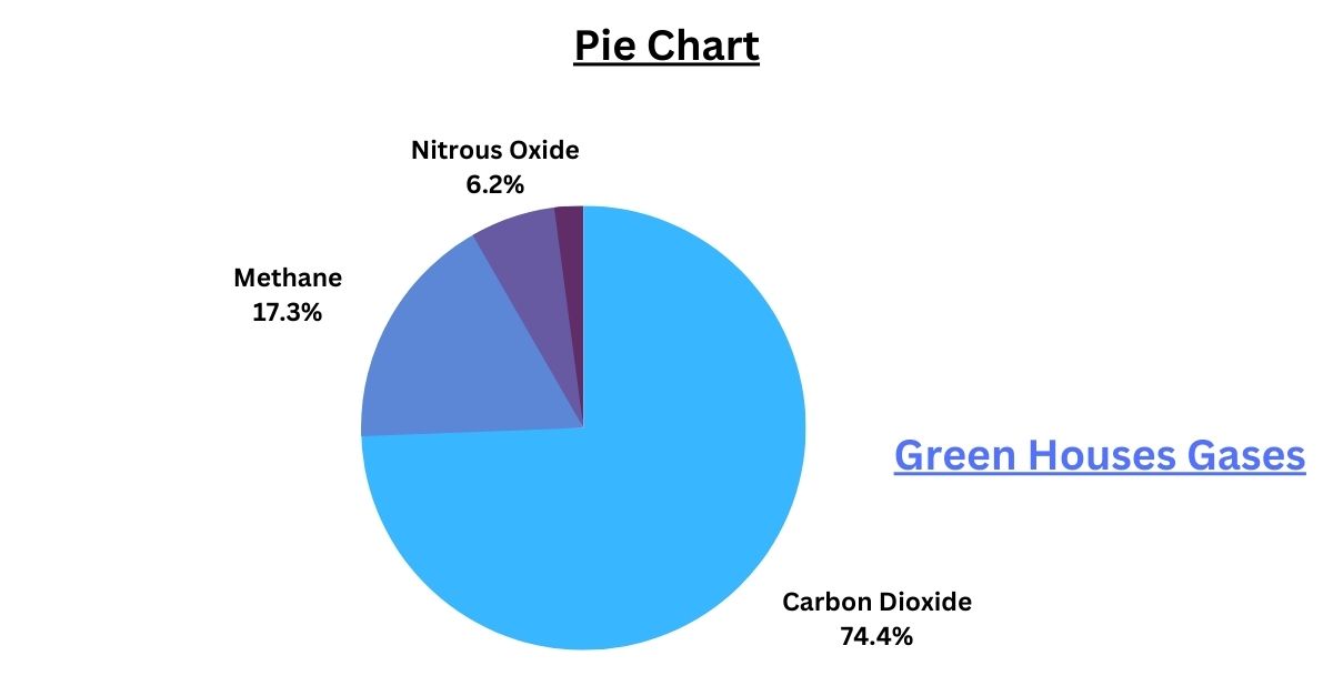
Pie Chart
They show the division of several elements and are very useful if the user reads the data. Pie charts show the parts of a whole. A pie chart works well when you want to compare substantially different proportions. Take a look at the following image. It represents the share of greenhouse gases in the atmosphere in percentage value.
Bar Graph
The function of a bar graph is to emphasize the comparison between elements, although the format does not lend itself to an understanding of big data.

Scatter Plot
A Scatter Plot is interesting if the goal is to show the relationship between different data points. It uses numeric values for both axes.

Line Chart
They are useful for showing trends, especially if they are rising. Shows the relationships of changes in the data over some time.

Bubble Chart
This is a variation of the scatter chart represented as bubbles. Depending on the size of these, the dimension of the data will be larger or smaller.

Treemap
Treemaps use rectangles to represent hierarchical data. They represent proportions and relationships between different levels of data.

The above chart represents the types of vehicles listed at an RTO.
Histogram
A histogram graphically represents the frequency distribution of variables in a data set. A histogram takes many data points, groups them into logical ranges, and represents them as bars. Taller bars show that more data is available in that range.
Take an example of the sum of vehicles. A histogram groups the number of the sum of vehicles based on the count of vehicles as listed on the left. The left bar denotes a lesser count (123-743), and the right bar denotes a higher count (743-1363)

Must Read – Histogram vs. Bar Graph: What is the Difference
Waterfall Charts
A waterfall chart represents an increasing effect of sequentially introduced positive or negative values. Rather than just showing a starting value in one bar and an ending value in another, a waterfall chart disaggregates all of the unique elements contributing to that net change and visualizes them separately.

Box and Whisker Plot
A box and whisker plot is a graphical method of displaying variation in a data set. It provides additional detail about the data while allowing multiple data sets to be displayed in the same graph.

Stacked Bar Maps
Stacked bar charts can present smaller categories inside a larger data category. They also demonstrate the role of each smaller category in creating the larger one.

Heat Maps
Heat maps use the magnitude of a phenomenon as colour in two dimensions to represent data. They are perfect for showing patterns and density.

Source – World Economic Forum
Word Clouds
They are word clouds or tags to discover trends.

Infographics
Data is used to share and disseminate information and generate discussion. It is usually used to generate traffic and links to a web page.
These are just a few examples of data visualization techniques; there are many more. Your choice of technique depends on the nature of the data and the insights you want to convey.
Best-suited Data Visualization courses for you
Learn Data Visualization with these high-rated online courses

Conclusion
Business entities can use data visualization techniques to interpret and communicate complex data effectively. Techniques such as pie charts, bar graphs, scatter plots, and heat maps allow businesses to understand trends and hidden insights within data and, ultimately, make informed decisions. Depending on the data type and message to be communicated, the choise of data visualization techniques will vary. With the right tools and techniques, data visualization transforms raw information into meaningful and actionable insights, supporting better decision-making and fostering growth.

Rashmi is a postgraduate in Biotechnology with a flair for research-oriented work and has an experience of over 13 years in content creation and social media handling. She has a diversified writing portfolio and aim... Read Full Bio