Creating Power BI Dashboards
Power BI is a powerful tool that makes it simple to connect to a variety of data sources and import data into a model.
The dashboard is a key component of the Power BI tool that allows you to keep track of your most important data at a glance. A dashboard integrates data from on-premises and the cloud. It gives you a unified view of your data, regardless of where it’s stored.
So, let’s get started with this Power BI dashboard article by going through the steps below in order:
- How to Create a Power BI Dashboard?
- Problem-statement and tasks to be performed
- Steps to create a Dashboard
How to Create a Power BI Dashboard?
A dashboard is a canvas on which you may combine various objects or visuals that represent datasets. It will provide you with an overview of the story that is contained in the detailed BI report because it comprises all of the necessary report sections. A dashboard is always one page long, whereas a report may be several pages long.
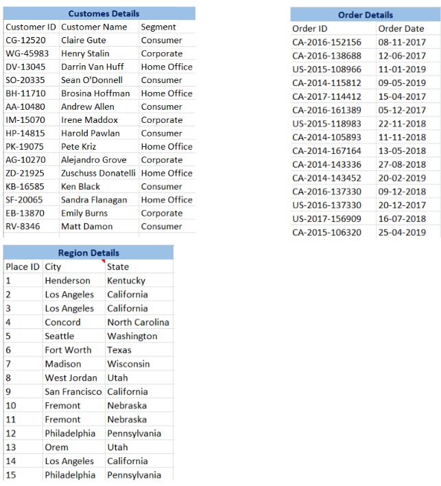
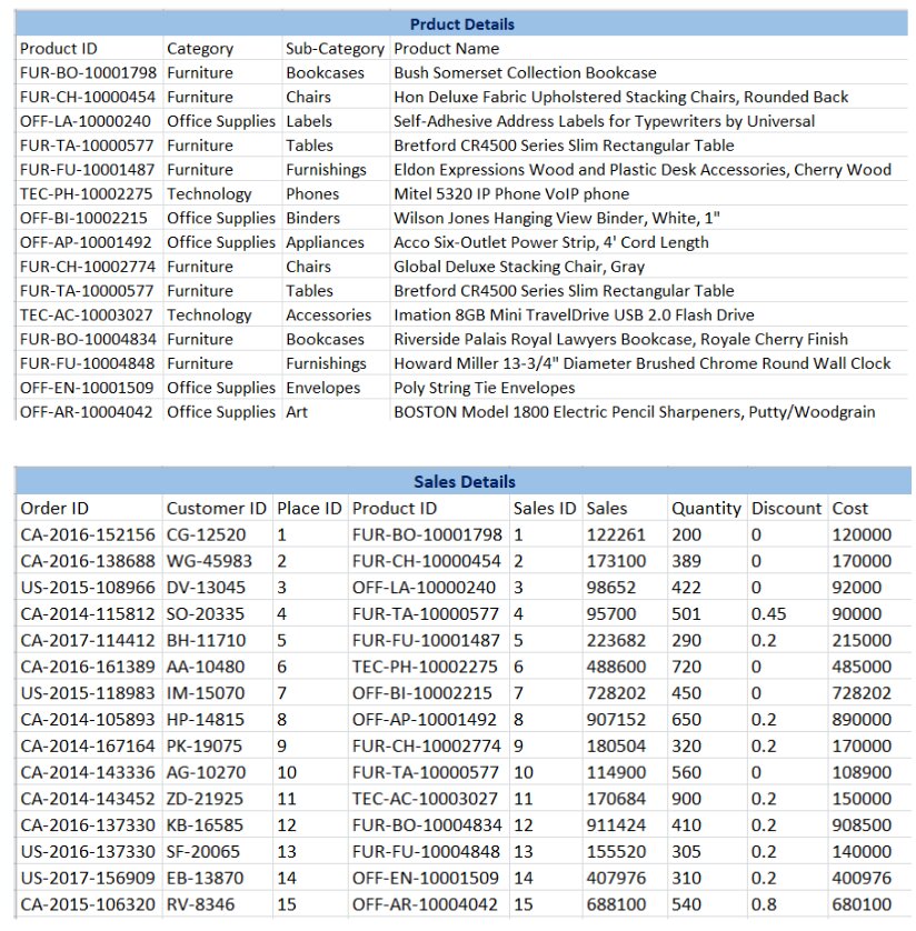
Let us understand the use of the Power BI dashboard with an example where the data set has different data types, each of which has the potential to reveal valuable business insights.
Best-suited Power BI courses for you
Learn Power BI with these high-rated online courses
Problem-statement and tasks to be performed
Assume you’re the manager of an E-commerce Store, and you want to increase the market share, and discover growth opportunities by keeping an eye on the trends of the industry and your company. But your daily Sales operations create a significant amount of data. And this amount of data grows as the days pass. When you look at the data on your computer, you notice a lot of figures and text in the tables that appear to be difficult to comprehend.
Now the company’s owner has asked you some questions from a business standpoint-
- Which region is the most profitable?
- What kind of product category should be given priority?
- Which segment needs more attention?
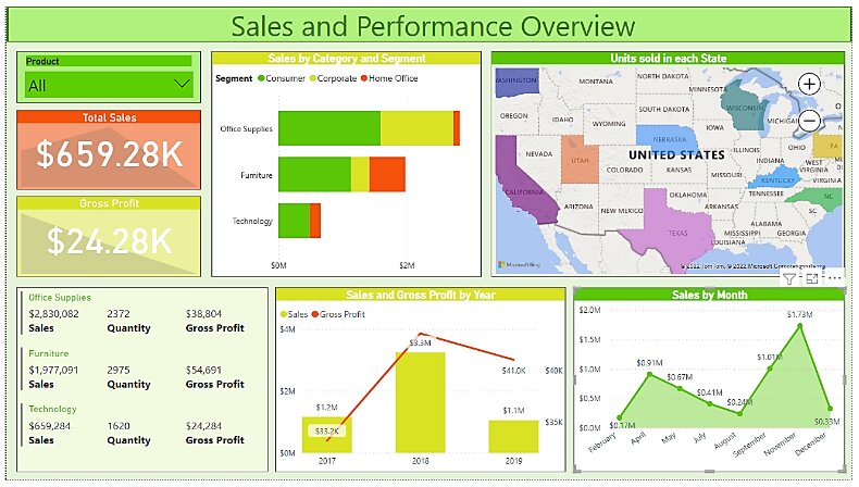
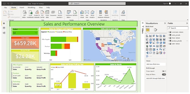
By going through these tables and values, you might be breaking your head understanding the trends, and answering his questions. Don’t worry. Let the below Power BI Dashboard do the heavy lifting for you.
Now I believe you can easily process the above data in the tables and gain insights into all the mentioned issues from this dashboard. Let’s see the kind of information we can derive from the store data set -:
- Overall store sales and performance: The first natural step is to acquire a sense of the store’s performance throughout time. In addition, we must determine which region is more profitable or loss-making than others.
- The performance of various states: These states can be mapped in order to comprehend various scenarios. For example, a company may decide to invest more in a state with lower sales but higher earnings. If sales are up but earnings are down in another state, that could be a red flag.
- The performance of various customer categories: It’s also crucial for the company to understand which client segments are generating sales and profitability in various categories.
- Sales generation by category: We can acquire statistics on specific product categories and how they compare (in terms of sales and profits) within specified geographies and customer segments.
So, how about we get this ball rolling and build our own dashboard to understand the data better.
Steps to create a Dashboard
Firstly we will import sales data relating to customers, products, regions, orders, and sales details into the Power BI system to generate this dashboard. If you want to work with me on these reports, you may use this link to get the Power BI desktop, which is the visualization interface we will use.
Let us get started now.
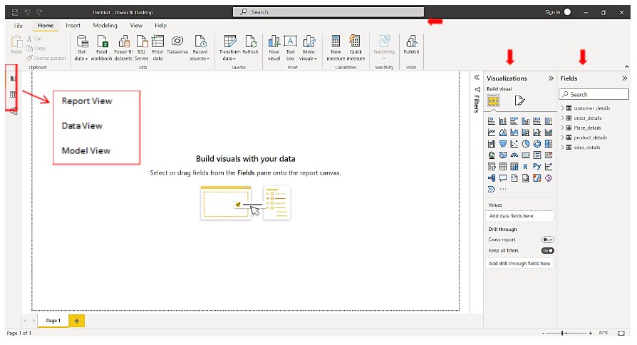
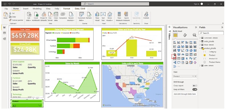
This workspace will emerge as soon as you launch Power BI Desktop. In the figure below, look for the portions marked with red arrows.
Home, View, Modeling, and Help are tabs on the top bar that include a variety of options. Visualizations and Fields are the two sections on the right. You can edit a visual by selecting it from the Visualizations section. All of the fields from the data tables you imported are listed in the Fields section. To add fields to your graphic, simply select them from this list.
Report, Data, and Model are the three buttons on the left. I’ll talk about them later.
Now, we will start with dashboard creation.
Step 1: Data Importing
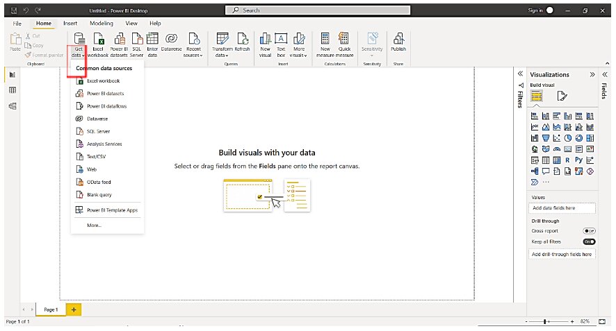
When you initially start constructing a dashboard with Power BI, the first step is to import data from source files. Select a data source by clicking on the Get Data option. Choose a data source and then click Connect.
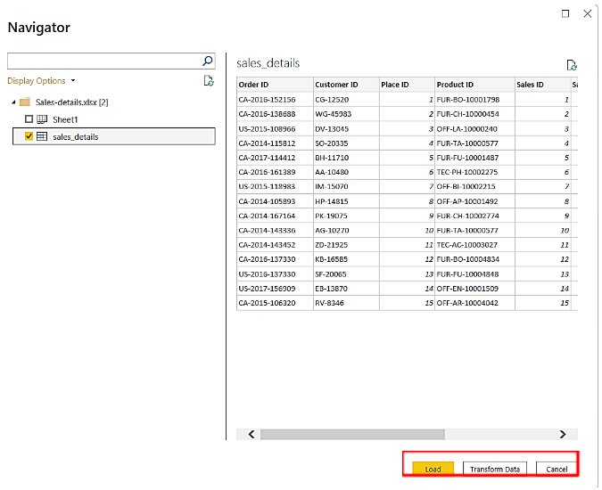
I have gone ahead and imported my Sales data set. Once you’ve imported the data set, the interface will provide you the choice to load or edit the data (in Power Query Editor), as shown in the image below.
Step 2: Data Formatting
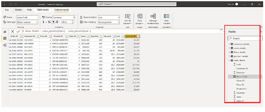
You may access all of the imported tables from the Data tab and see them in tabular format. You can find a list of tables and fields inside those tables on the right and can conduct formatting operations on a table or field by selecting it. This also allows you to alter the format or data type of fields like date, time, city, state, percentage value, currency, and so on from the Modeling tab.
Step 3: Data Modeling
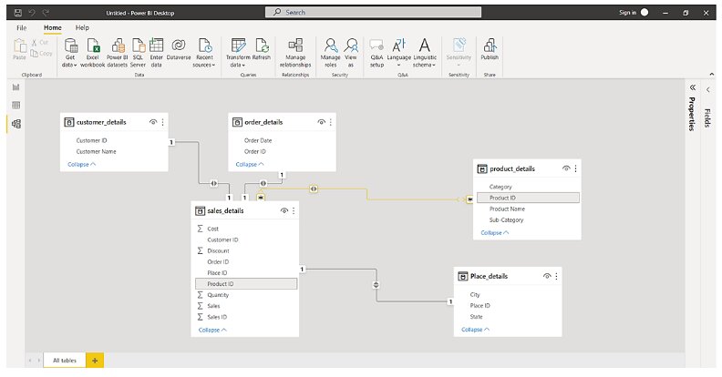
Despite the fact that the Power BI engine has already built relationships and associations between the tables you load, you can still review and edit the data model using the Model tab on the left horizontal bar. Links connecting two common fields represent the relationships between the two tables.
My goal was to help you understand the fundamentals of Power BI’s user interface. I believe they were fairly simple to comprehend. So, let’s stick with our use case and try to visualize the data we talked about earlier.
Must Explore – Data Visualization with Power BI
Step 4: Create a KPI for Total Sales and Gross profit
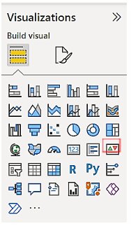
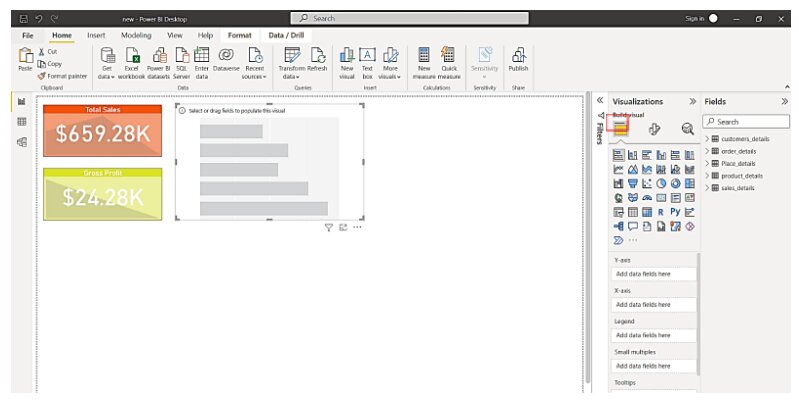
So I imported five tables for my dashboard. The first visualization we’ll create is a KPI. For this, I will select the KPI chart from the visualizations section.
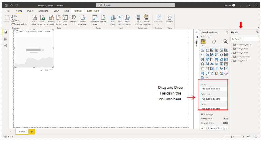
From the Fields section, I will choose the fields I need to include in the graphic. You can also drag & drop the fields into the columns shown in the figure below, as indicated by the arrow.
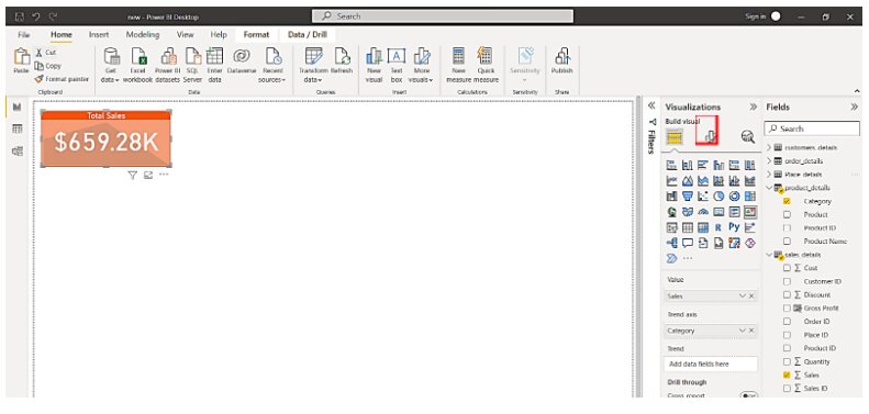
After selecting the fields, you can apply filters and format the visual from the Format icon. The first KPI I prepared shows Total sales.
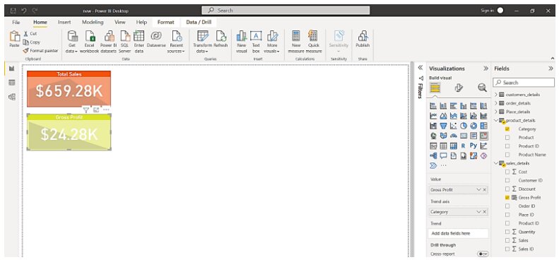
The Gross Profit is shown in the second KPI.
Step 5: Create a chart showing Sales by Segment and Category
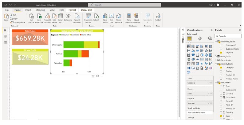
Next, we’ll make a stacked bar chart to show sales value by customer segment and product category.
You can format the title, data labels, legend, axes, plot area, data colors, and other fields in the chart. As you can see in the image below, the stacked bar chart depicts total sales with respect to Customer Segment for the three main categories (Furniture, Office Supplies, and Technology).
Step 6: Create a chart showing Sales and Gross profit by Year
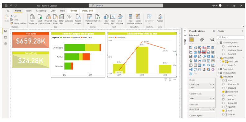
Moving on, we’ll make a column chart as our next visualization (Line and clustered column chart). We’ll make this chart to demonstrate total sales and gross profit over time (2017, 2018, and 2019).
Must Explore – Power BI Comparison Charts
Then you can add fields to the visual. The selected fields are displayed on the Fields tab.
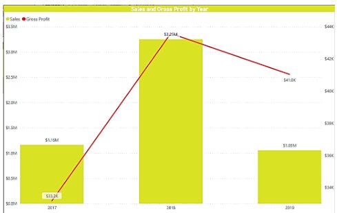
As you can see in the image below, our final visual is as follows. The yellow bars represent three years’ worth of total sales, whereas the red line represents three years’ worth of profit.
Step 7: Create a chart showing Sales by Month
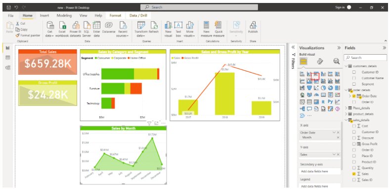
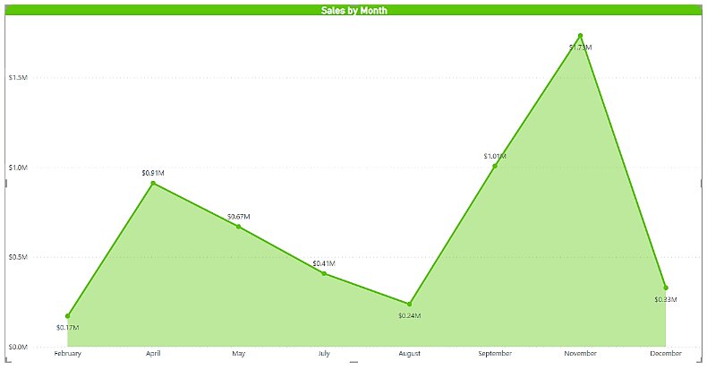
Now, we’ll make an area chart that shows total product sales over the course of a year. By selecting the Area chart from Visualizations and entering the appropriate fields, you can see I was able to construct an area chart.
This is what the area chart that we made looks like. The x-axis shows the months in which the product was sold, while the y-axis shows the sales figures.
Step 8: Create a multi-row card
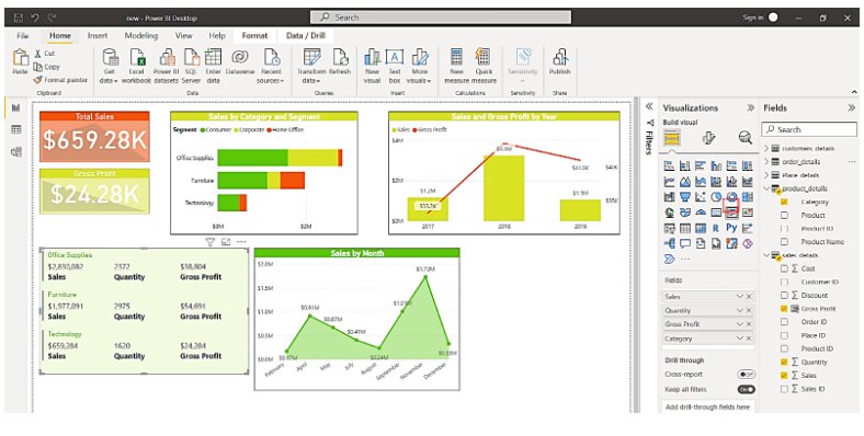
You can display data as textual information using cards or multi-row cards in addition to visually representing it with graphs and charts.
I have a multi-row card that displays data on product categories, total sales per category, total units sold, and gross profit.
Step 9: Create a map showing the total units sold by the state
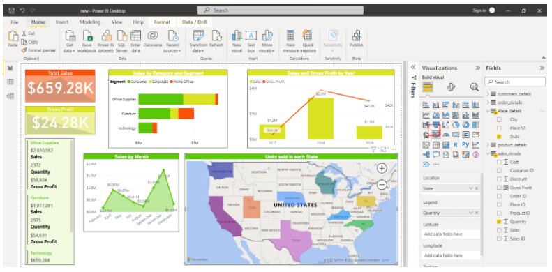
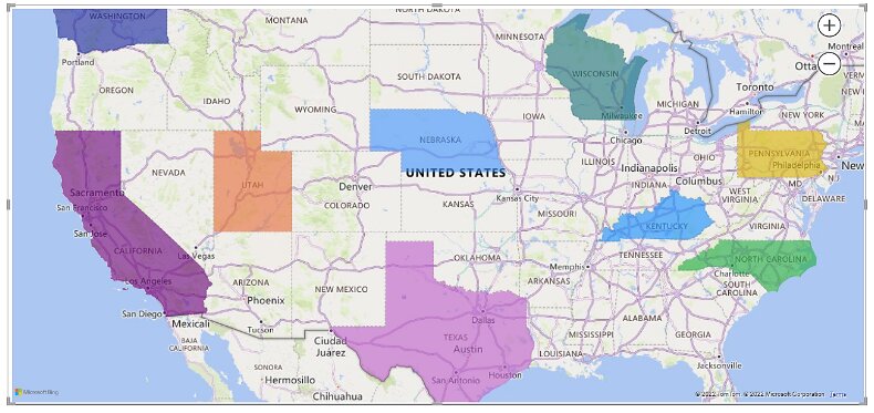
We may also depict information on the map using the large range of visualizations available. We’ll include a map of total units sold per state in the United States on our dashboard. From the Visualizations menu, we chose a Filled map.
The total number of units sold in each state will be shown on the final map.
Step 10: Add a slicer for Sub-categories of the product
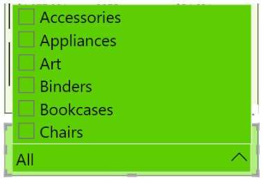
Finally, we’ll include a Slicer for product sub-categories in the record. Users can select certain categories and filter data with this slicer. When you make a selection in the slicer, all of the other visuals alter to show only the visuals relating to the field or value you choose.
Let us have a closer look at the slicer I added to our dashboard.
Step 11: Finishing the final dashboard
We’re nearing the end of the process now that we’ve included all of the different types of visualizations and graphics in our dashboard. You can resize and adjust the visuals on the dashboard as needed. You can also customize the dashboard’s theme, page size, and background.
Step 12: Publishing the dashboard
To publish the dashboard on the web, select the Publish option. After you log in to your Power BI account, the publication procedure will go smoothly. Then you’ll be given a connection to a web source where the dashboard has been uploaded and is accessible to other users.
In a nutshell
This brings us to the end of our Power BI Dashboards article. We discovered what dashboards are and how they differ from reports. We also did a hands-on activity with example data in Power BI to create a dashboard. You can construct a dashboard that suits your circumstances and needs by using your own data sets.
Top Trending Tech Articles:Career Opportunities after BTech Online Python Compiler What is Coding Queue Data Structure Top Programming Language Trending DevOps Tools Highest Paid IT Jobs Most In Demand IT Skills Networking Interview Questions Features of Java Basic Linux Commands Amazon Interview Questions
Recently completed any professional course/certification from the market? Tell us what liked or disliked in the course for more curated content.
Click here to submit its review with Shiksha Online.
This is a collection of insightful articles from domain experts in the fields of Cloud Computing, DevOps, AWS, Data Science, Machine Learning, AI, and Natural Language Processing. The range of topics caters to upski... Read Full Bio


