Creating Interactive Data Visualization in Python using Plotly
by Sumeet Jain
Data Visualization is crucial for any kind of business to succeed. With Data Visualization various unknown facts and key details can easily be communicated. In every organization, the size of data keeps on increasing and basic static points fail to give a clear picture with time. To communicate the key insights and critical information easily data visualization is obligatory.
In this article, we will go through with the scenario of Ravi. Ravi is a Data Analyst in an online shopping company. Ravi has been given a task to generate insights from the historical data of the sales. The data contains the following attributes:
- Order_ID: Unique ID of order.
- Order_Date: Date on which item was ordered.
- Ship_Date: Date on which item was shipped from the warehouse.
- Ship_Mode: Mode of shipping
- Customer_ID: Unique ID of the customer
- Segment: Item segment consumer, corporate, or home office.
- Country: Country where the item has to be delivered.
- City: City where the item has to be delivered.
- State: State where the item has to be delivered.
- Region: Region where the item has to be delivered.
- Product_ID: Unique ID of the item ordered.
- Category: Item category.
- SubCategory: Item Sub Category.
- Sales: Cost of item.
- Discount: Percentage of the discount applied.
- Shipping: Cost of shipping the item
Ravi has chosen to use Plotly to visualize the attributes.
But, Why Plotly?
Plotly is one of the most famous and open-source python libraries for interactive data visualization. Also, Plotly’s community is really big and you can always find a solution to your problem there.
Best-suited Data Visualization courses for you
Learn Data Visualization with these high-rated online courses
Introduction to Plotly
Plotly is a data analytics and visualization company that has developed open-source API libraries in R, Python, and other programming languages. Plotly has more than 40 types of plots and also has a dashboarding tool known as Dash.
To get started with Plotly you will have to install the library first. To install it you can just use the !pip magic command:
!pip install plotly
Plotting Figures
Before getting started with plotting, let us understand the structure of a Plotly figure. A Plotly figure contains 3 top-level attributes:
- Data: Contains the list of Traces. A trace is nothing but a dictionary of data parameters, color information, and line types. With this, you can include multiple types of graphs.
- Layout: A dictionary that contains positioning and plot configurations like margin, title, hover-data, and so on. You can use update_layout() method always to update the layout attributes.
- Figure: A list of dictionaries for animations or it can be a single figure.
The above attributes make up a plotly figure. There are two ways you can get started with plots on plotly:
- Plotly Express: Simple predefined functions to plot simple plots.
- Plotly Graph Objects: Rather complex way to create plots but gives more freedom over the plot. This is also responsible for creating plots.
Simply, we can say that Plotly Express is a high-level API while Plot Graph Objects are low level.
Plotly Toolbar
On every plotly figure, you will see the above toolbar whenever you over the figure. You can manually set the tools or even disable the toolbar completely. The toolbar provides a basic set of tools like zooming, panning, comparing, and can even take snapshots of the figure.
Boxplot
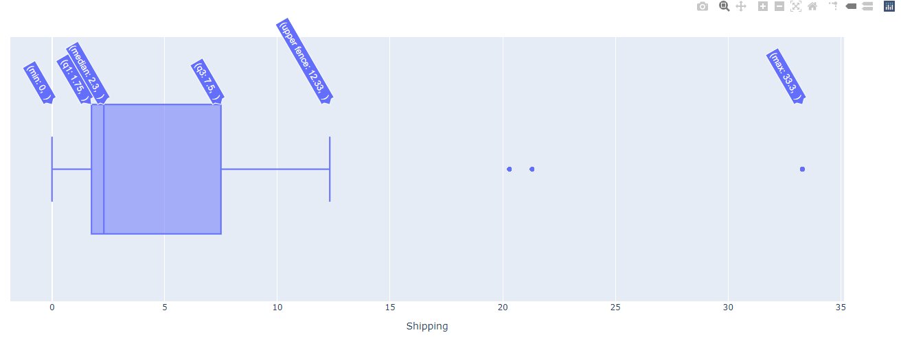
Ravi wants to see the outliers for the shipping costs. So he built a boxplot using plotly as follows:
fig=px.box(data,x='Shipping')
fig.show()
Minimum > First quantile(Q1) > Median > Third quantile(Q3) > Maximum points box() XY x y
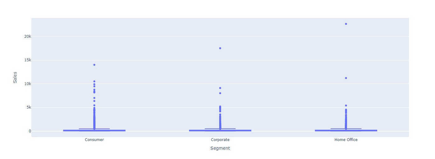
fig=px.box(data,x='Segment',y='Sales')
fig.show()
Bar Plot
Bar charts are plotted using the bar() function in plotly express. It also takes a similar set of arguments but giving x and y arguments is necessary. Otherwise, plotly plots the graph by taking the same column in both the axes. Ravi got the basic idea that the highest purchase was made in the Home Office segment. Now, he wants to plot the average sales in each segment:
sales_per_seg=data.groupby('Segment').mean()
fig = px.bar(y=sales_per_seg.index,x=sales_per_seg.Sales, orientation='h',labels={
                     "x": "Average Sales",
                     "y": "Segment",
                 })
fig.update_layout(title_text='<b>Sales Per Segment</b>',
                title_x=0.5,
                autosize=False,)
fig.show()
As you can see, Ravi uses the HTML tags in the title_text argument. And he also set the label manually using a dictionary for labels. The above plot shows that Home Office has the highest average sales. Later, Ravi also creates a sorted barplot for total sales in every state till now:
sales_per_seg=data.groupby('Segment').mean()
fig = px.bar(y=sales_per_seg.index,x=sales_per_seg.Sales, orientation='h',labels={
                     "x": "Average Sales",
                     "y": "Segment",
                 })
fig.update_layout(title_text='<b>Sales Per Segment</b>',
                title_x=0.5,
                autosize=False,)
fig.show()
Line Plot
Ravi wants to generate see the total sales for each month for each region. First, he gets the month name from the order date. Then, he groups the data by Order_Month and Region. At last, he sorts the data by month by changing to an ordered categorical datatype and plots the data:
from pandas.api.types import CategoricalDtype
data['Order_Month']=pd.to_datetime(data.Order_Date).dt.month_name()
ship_data=data.groupby(by=['Order_Month','Region']).sum().reset_index()
ship_data.Order_Month=ship_data.Order_Month.astype(CategoricalDtype(['January','February', 'March', 'April', 'May',
        'June','July','September', 'August','October', 'November', 'December'  ],ordered=True))
ship_data=ship_data.sort_values(by='Order_Month')
px.line(ship_data, x="Order_Month",y='Sales', color='Region')
In the above, plot we can see that South Region gets the most sales in the month of march only and then it generate the least sales.
Scatter Plots
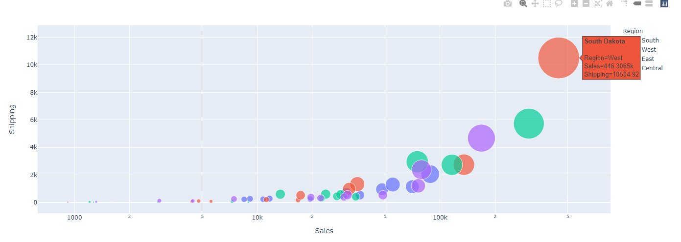
Scatter plots are a great way to include multiple variables into the visualization. Check the below plot and see how Ravi included:
state_sales=data.groupby(['State','Region']).sum().reset_index()
fig=px.scatter(state_sales, x="Sales", y="Shipping",size="Shipping", color="Region",
                 hover_name=country_sales.index, log_x=True, size_max=60)
fig.show()
We can say that South Dakota made the highest sales and has the highest total shipping cost which is in the West Region.
Maps
Plotly is great for geospatial data visualization. Ravi has created the scatterplot for sales across each state:
The code is available in the jupyter notebook attached to the blog. Ravi took the coordinates for each state and using the coordinates he plotted the data.
Pie Charts
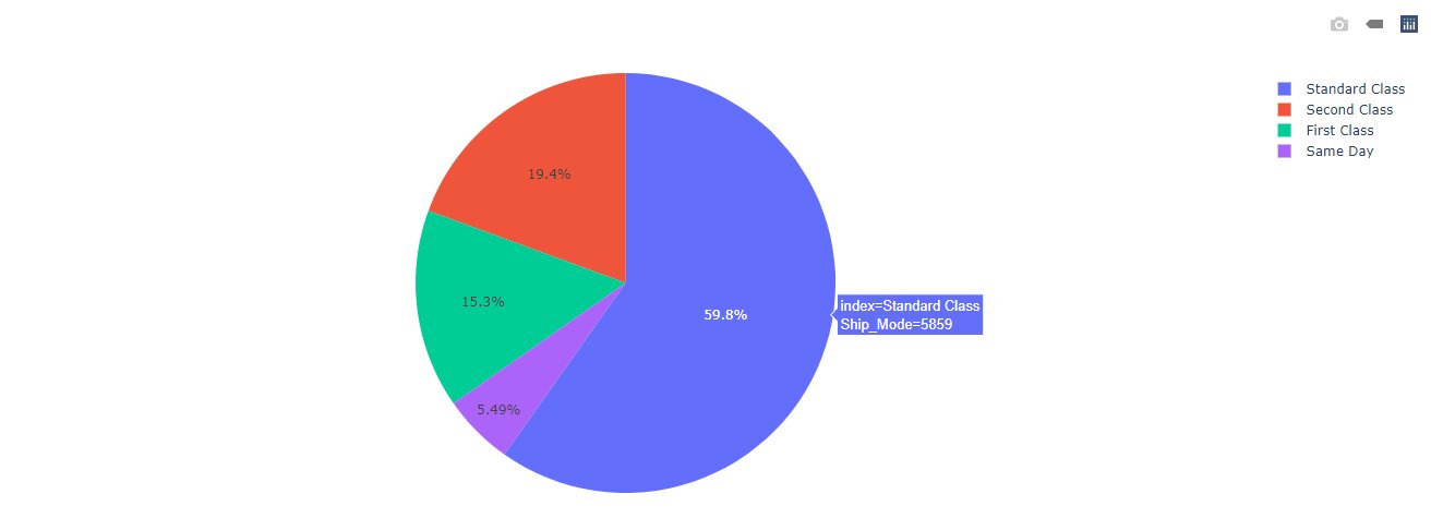
Pie charts are used to show the data distribution among a set of classes. Likewise, Ravi has used it to show the data distribution across shipping mode:
mode=data.Ship_Mode.value_counts().reset_index()
px.pie(mode,names='index',values='Ship_Mode')
Dropdowns in Plotly
To make plotly more interactive you can add dropdowns, sliders, and buttons as well. Let’s see how Ravi has created the dropdown to show the Sales, Discounts, and Shipping for different types of sub-categories of products:
category_sales=data.groupby('SubCategory').sum().reset_index()
plot = go.Figure(data=[go.Bar(name='Sales',x=category_sales['SubCategory'],y=category_sales['Sales']
),
    go.Bar(name='Discount',x=category_sales['SubCategory'],y=category_sales['Discount']
),
    go.Bar(name='Shipping',x=category_sales['SubCategory'],y=category_sales['Shipping']
)
])
# Add dropdown
plot.update_layout(
    updatemenus=[
        dict(
            active=0,
            buttons=list([
                dict(label="Sales",method="update",args=[{"visible": [False, False, True]},
                           {"title": "Sales"}]),
                dict(label="Discount",method="update",args=[{"visible": [False,True, False]},
                           {"title": "Discounts",
                            }]),
                dict(label="Shipping",method="update",args=[{"visible": [True, False, False]},
                           {"title": "Shipping Costs",
                            }]),
            ]),
        )
    ])

plot.show()
Conclusion
In this article, we saw that how Ravi was able to use Plotly for elegant, simple, and interactive plots. Plotly has also online graphing tools however, they are pay-to-use after 25 plots. You can always use plotly offline for your projects to make them more interactive and easier to understand.
————————————————————————————————————–
If you have recently completed a professional course/certification, click here to submit a review.
This is a collection of insightful articles from domain experts in the fields of Cloud Computing, DevOps, AWS, Data Science, Machine Learning, AI, and Natural Language Processing. The range of topics caters to upski... Read Full Bio


