Dual Axis Chart in Tableau
In this article we will discuss one of the type of chart in tableau i.e. Dual Axis Chart in Tableau with an example.
Introduction
In this article, we will discuss the Dual Axis chart in the tableau.
Tableau is a data visualization tool that allows drawing different charts and graphs using Show me with just simple drag and drop.
Tableau Show Me has 24 different charts.
Each chart in the tableau corresponds to a minimum number of dimensions, measures, bins, etc.
Best-suited Tableau courses for you
Learn Tableau with these high-rated online courses
Table of Content
There are 3 ways to compare multiple measures in a single view:
- Individual axes for each measure
- Blend two-measure two share an axes
- Add dual axes where two independent axes are layered in the same pane
What is a Dual Axis Chart?
Dual-axis charts are a combination of two charts. It is used to visualize two or more different measures in two different chart types i.e. it depicts the relationship between two variables with different amplitude and scale.
To create a dual-axis chart we must have one date column and two measures.
Let’s understand how to create a Dual Axis Chart in Tableau with an example
To know more about Tableau, Click Here.
Create a dual-axes chart of discount and profit for categories.


Steps to create a Dual Axis Chart
- Connect a file (here, we will use Sample SuperStore data)
- Drag and Drop Category into the column shelf
- Drag and Drop Profit and Discount into the row shelf
- Here, we have two charts present on multiple axes
- Right-click on Sum (Profit)
- Select Dual-axis from the drop-down
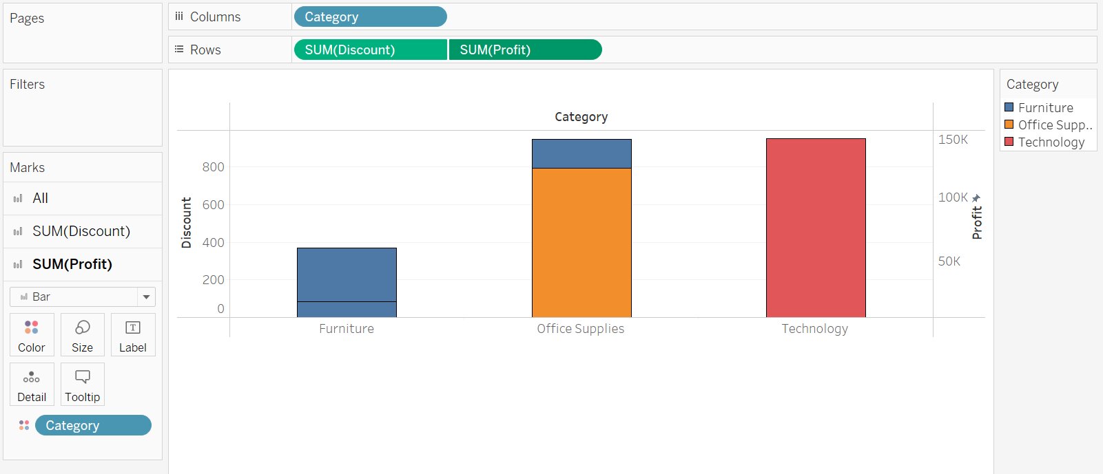
- We get the desired dual-axis chart
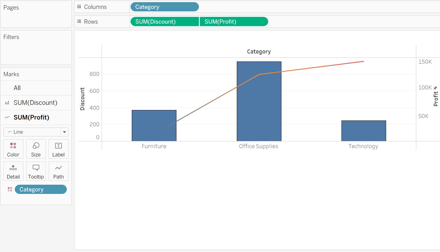
Note: The above graph is a stacked bar graph. We can make it a bar and line (or whatever graph you want) graph in a few steps.
- In the Mark pane, you will get SUM(Discount) and SUM(Profit)
- Select the required chart from the drop-down
- In SUM(Discount) select Bar chart
- In SUM(Profit) select Line Chart
Click Here: To know more about Top Tableau Online Course & Certification.


Conclusion
In this article, we have discussed the Dual Axis Chart in Tableau with an example.
Hope this article will help you in your data/business analyst journey.
This article is a part of a complete tutorial on Tableau, focusing on Tableau certified data analysts and tableau desktop specialists.
Through a series of articles, we will cover all the topics in-depth with examples.
Top Trending Articles:
Data Analyst Interview Questions | Data Science Interview Questions | Machine Learning Applications | Big Data vs Machine Learning | Data Scientist vs Data Analyst | How to Become a Data Analyst | Data Science vs. Big Data vs. Data Analytics | What is Data Science | What is a Data Scientist | What is Data Analyst


