Heatmap in Seaborn
Introduction
In Machine Learning and Data Science, when working with data, you’re sure to perform Exploratory Data Analysis (EDA) to analyze the data before getting on with model development.
EDA helps summarize the main characteristics of your data, mostly employing data visualization methods.
Seaborn is a very popular data visualization library in Python. It is an extension to Python’s Matplotlib library and offers an easy, intuitive, yet highly customizable API for data visualization.
For this article, we are going to focus on Heatmap in Seaborn – a common technique used to observe relationships between variables in your data through color-coding. Let’s see how to perform EDA with heatmaps in Python using Seaborn.
We will be covering the following sections:
Best-suited Data Visualization courses for you
Learn Data Visualization with these high-rated online courses
Table of Content
- Introduction to Heatmaps
- Installing and Importing Seaborn
- Creating Heatmap using Seaborn
- Customizing Heatmaps
Introduction to Heatmaps
A Heat map is a graphical representation of multivariate data that is structured as a matrix of columns and rows.
Heat maps are very useful in describing correlation among several numerical variables, visualizing patterns and anomalies.
What is meant by correlation?
- Correlation is a dimensionless unit that determines the degree to which variables are related.
- It measures both strength and direction of the linear relationship between variables.
- Its value lies between 0 and 1, depicting strength.
- + and – signs depict direction.
Correlation Matrix
A correlation matrix denotes the correlation coefficients between variables at the same time.
A heat map represents these coefficients to visualize the strength of correlation among variables. It helps find features that are best for Machine Learning model building.
The heat map transforms the correlation matrix into color coding.
The correlation matrix shows how the variables are correlated to each other on a scale of -1 to 1, with 1 being a perfect positive correlation and -1 being a perfect inverse correlation.
Now, we will understand how to create a heat map to determine the correlation between multiple variables.
The dataset used in this blog can be found here. This dataset contains information on cars such as their make, model, year, engine, and other properties.
We need to ascertain if there is a relationship between the features of this dataset.
So, let’s get started, shall we?
Installing and Importing Seaborn
First, let’s install the Seaborn library in your working environment. Execute the following command in your terminal:
pip install seaborn
Once Seaborn is installed, ensure that you also install the necessary packages and libraries that Seaborn is dependent on:
- Pandas
- NumPy
- Matplotlib
- SciPy
Now let’s import the libraries we’re going to need today:
import seaborn as sns
import pandas as pd
import numpy as np
import matplotlib.pyplot as plt
%matplotlib inline
Creating a Heatmap using Seaborn
Load the dataset
Prior to creating our plot, let’s check out the dataset:
#Read the dataset
df = pd.read_csv('data.csv')
df.head()
#Check out the number of columns
df.shape
There are 16 columns (or features) in this dataset. Let’s print them all:
#List all column names
print(df.columns)
We need to remember that heat maps cannot visualize categorical features.
So, we are only going to focus on the numerical features of the datasets.
Plotting the data
Now, we will plot the data using Seaborn’s heatmap() function.
But before that let’s create a correlation matrix using the corr() function:
#Calculating correlation between each pair of variables
corr_matrix=df.corr()

#Creating a seaborn heatmap
sns.heatmap(corr_matrix)
A heat map is generated as shown above. Note that the corr() function selects the ideal (read: numerical) features for the plot.
Customizing Heatmaps
Let’s enlarge one of our graphs to view it clearly:
- We’ll specify the figsize parameter in the plt.figure() function of Matplotlib to set the dimensions of the figure in inches.
plt.figure(1, figsize=(10,5))
sns.heatmap(corr_matrix)
- cmap: maps data values to color space.
#Parameter - cmap
plt.figure(1, figsize=(10,5))
sns.heatmap(corr_matrix, cmap='BrBG')
As you can see, we have specified the color palette to Browns Blue Greens.
You can set different color shades or color combinations as well.
- center: specifies the value at which to center the colormap when plotting divergent data.
#Parameter - center
plt.figure(1, figsize=(10,5))
sns.heatmap(corr_matrix, cmap='BrBG', center=0)
- annot: when set to boolean True, displays the correlation coefficient for each matrix cell.
#Parameter - annot
plt.figure(1, figsize=(10,5))
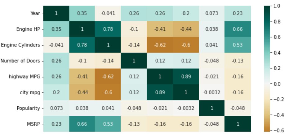
sns.heatmap(corr_matrix, cmap='BrBG', center=0, annot=True)
- cbar: set to Boolean True by default. When set to False, it removes the color bar beside the heatmap.
#Parameter - cbar
plt.figure(1, figsize=(10,5))
sns.heatmap(corr_matrix, cmap='BrBG', center=0, annot=True, cbar=False)
- linewidths: specifies the width of the lines that will divide each cell.
- linecolor: specifies the color of the lines that will divide each cell.
#Parameters - linewidths and linecolor
plt.figure(1, figsize=(10,5))
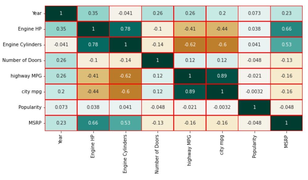
sns.heatmap(corr_matrix, cmap='BrBG', center=0, annot=True, cbar=False, linewidths=0.5, linecolor='red')
- yticklabels and xticklabels: control the presence of labels for the Y and X-axis respectively. They are set to Boolean True by default. When set to False, it removes the labels from the heatmap.
#Parameter - xticklabels
plt.figure(1, figsize=(10,5))
sns.heatmap(corr_matrix, cmap='BrBG', center=0, annot=True, xticklabels=False)
- square: when set to Boolean True, displays the heatmap in a squared form.
#Parameter - square
plt.figure(1, figsize=(10,5))
sns.heatmap(corr_matrix, cmap='BrBG', center=0, annot=True, square=True)
From our heatmap above, we can infer the following:
- Features ‘city mpg’ and ‘highway MPG’ have a strong positive correlation with a value of 0.89
- Features ‘Engine Cylinders’ and ‘Engine HP’ also have a strong positive correlation with a value of 0.78
- Another positive correlation is between features ‘Engine Cylinders’ and ‘Engine HP’ with feature ‘MSRP’. The values being 0.53 and 0.66 respectively
- Feature ‘Engine Cylinders’ has a strong negative correlation with features ‘city mpg’ and ‘highway MPG’ with values -0.6 and -0.62 respectively
Conclusion
The primary purpose of the Heatmap in Seaborn is to display a color-coded correlation matrix for easy visualization of the relationship between the features in the data.
Seaborn is easier to customize and much more functional and organized than Matplotlib for basic plots.
Top Trending Articles:
Data Analyst Interview Questions | Data Science Interview Questions | Machine Learning Applications | Big Data vs Machine Learning | Data Scientist vs Data Analyst | How to Become a Data Analyst | Data Science vs. Big Data vs. Data Analytics | What is Data Science | What is a Data Scientist | What is Data Analyst
This is a collection of insightful articles from domain experts in the fields of Cloud Computing, DevOps, AWS, Data Science, Machine Learning, AI, and Natural Language Processing. The range of topics caters to upski... Read Full Bio


