Histogram in Seaborn
Introduction
A histogram represents the frequency (count) or proportion (count/total count) of cases for continuous data.
We are back with a tutorial on Histogram using Python’s Seaborn library.
Seaborn is built on top of Python’s core visualization library Matplotlib, meaning it makes use of Matplotlib functionalities.
We have already learned Matplotlib Histogram.
Best-suited Data Visualization courses for you
Learn Data Visualization with these high-rated online courses
Table of Content:
- Introduction to Histogram
- Installing and Importing Seaborn
- Creating a Seaborn Histogram
- Parameters of Histogram
Introduction to Histogram
A histogram is used to analyze the probability distribution of univariate numerical data by plotting the count of the data instead of the values.
Histogram divides the entire range of values into a series of intervals called bins.
It then counts the number of values that fall in each bin and visualizes the results intuitively.
We will learn how to plot histograms using seaborn through a fun little example.
The dataset used in this blog can be found here. It contains information on the performance of students in math, reading, and writing exams.
We need to ascertain the percentage distribution of students’ marks from this dataset.
Let’s get started, shall we?
Installing and Importing Seaborn
First, let’s install the Seaborn library in your working environment.
Execute the following command in your terminal:
pip install seaborn
Once Seaborn is installed, ensure that you also install the necessary packages and libraries that Seaborn is dependent on:
- Pandas
- NumPy
- Matplotlib
- SciPy
Now let’s import the libraries we’re going to need today:
import seaborn as sns
import pandas as pd
import numpy as np
import matplotlib.pyplot as plt
%matplotlib inline
Creating a Seaborn Histogram
Load the dataset
Prior to creating our graphs, let’s check out the dataset:
#Read the dataset
df = pd.read_csv('StudentsPerformance.csv')
df.head()
#Check out the number of columns
df.shape
There are 8 columns (or features) in this dataset. Let’s print them all:
#List all column names
print(df.columns)
Based on our requirement, our focus is going to be on the math score, reading score, and writing score columns from the dataset.
Plotting the data
Now, let’s plot a histogram for marks in math using Seaborn’s histplot() function:
#Creating Seaborn Histogram
sns.histplot(data=df, x=df["math score"])
A histogram is generated as shown above.
Since Seaborn is based on Matplotlib, you can add different pyplot elements to interpret a graph better:
- plt.title() for setting a plot title
- plt.xlabel() and plt.ylabel() for labeling x and y-axis respectively
- plt.legend() for the observation variables
- plt.show() for displaying the plot
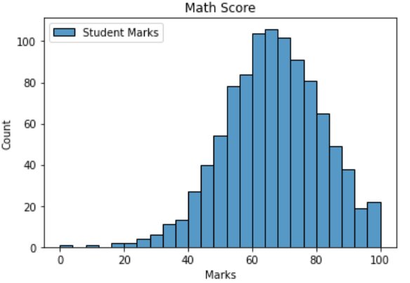
sns.histplot(data=df, x=df["math score"], label='Student Marks')
plt.title("Math Score")
plt.xlabel("Marks")
plt.ylabel("Count")
plt.legend()
plt.show()
Parameters of Histogram
Firstly, let’s specify the bins in our graph through the bins parameter:
- If bins is an integer, it defines the number of equal-width bins in the range
- If bins is a sequence, it defines the bin edges
#Parameter - bins
sns.histplot(data=df, x=df["math score"], bins=30)
plt.title("Math Score")
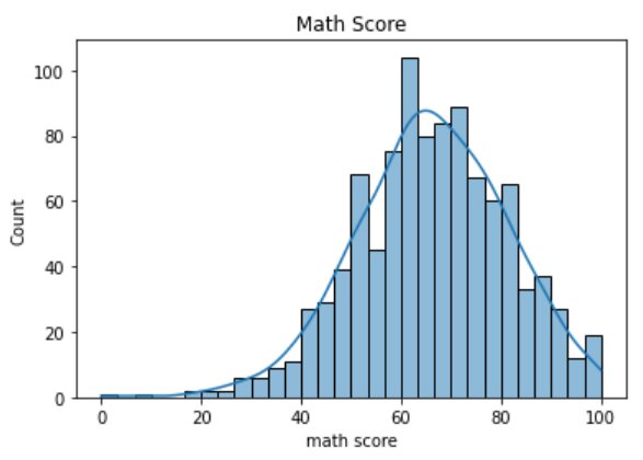
- The kde parameter is a Boolean value. If True, it computes a kernel density estimate to smooth the distribution shows on the plot as line:
#Parameter - kde
sns.histplot(data=df, x=df["math score"], bins=30, kde=True)
plt.title("Math Score")
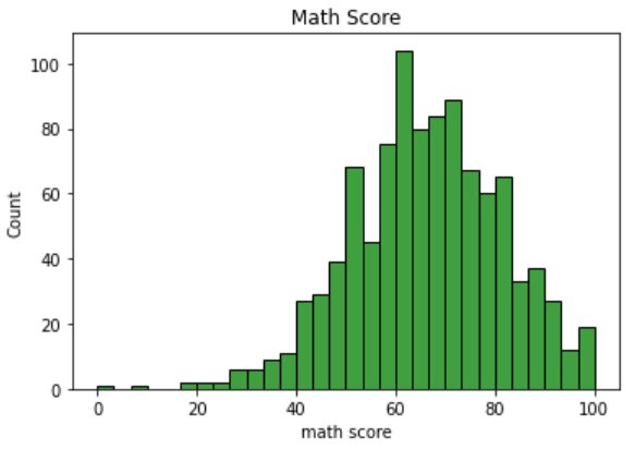
- color: used to specify the color of the bins:
#Parameter - color
sns.histplot(data=df, x=df["math score"], bins=30, color='green')
plt.title("Math Score")
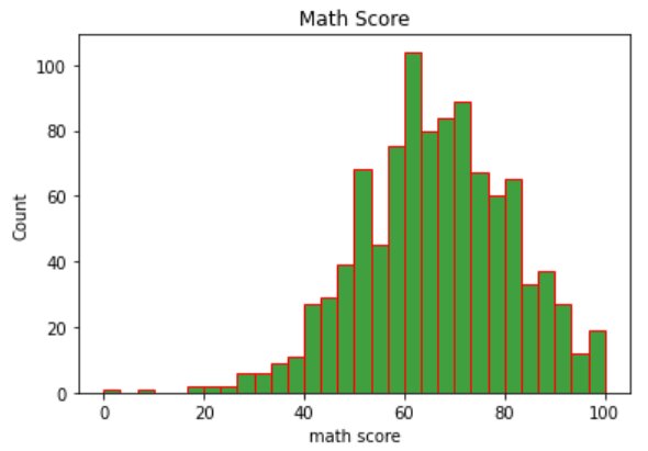
- edgecolor: used to highlight the bin edges with the specified color:
#Parameter - edgecolor
sns.histplot(data=df, x=df["math score"], bins=30, color='green', edgecolor='red')
plt.title("Math Score")
Creating a histogram with multiple categories
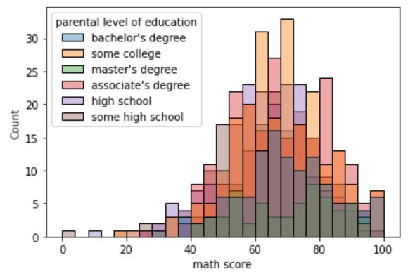
Let’s try to plot the distribution of the math score variable for parental level of education of students. We will do this using the hue parameter.
- The hue parameter maps a column name to determine the color of plot elements:
#Parameter - hue
sns.histplot(data=df, x=df["math score"], hue='parental level of education')
- The alpha parameter takes an integer between 0 and 1 and specifies the transparency of each histogram:
#Parameter - alpha
sns.histplot(data=df, x=df["math score"], hue='parental level of education',  alpha=0.4)
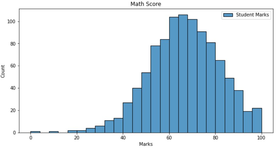
Let’s enlarge one of our graphs to view it clearly:
- We’ll specify the figsize parameter in the plt.figure() function of Matplotlib to set the dimensions of the figure in inches.
plt.figure(1, figsize=(10,5))

sns.histplot(data=df, x=df["math score"], label='Student Marks')
plt.title("Math Score")
plt.xlabel("Marks")
plt.ylabel("Count")
plt.legend()
plt.show()
From the above plot, we can make some inferences:
- The majority of the students have scored between 60-80 marks in their math exam
- Few students have scored below 30, so the performance of the students in math seems to be good
Now, what if you want to plot the distribution of scores for reading and writing as well?
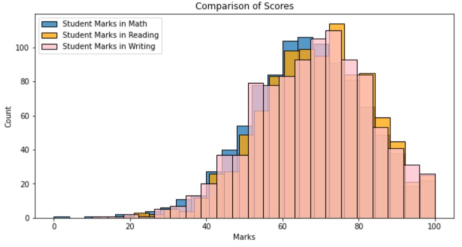
Now, plot distributions for math score, reading score, and writing score in a single figure:
plt.figure(1, figsize=(10,5))

sns.histplot(data=df, x=df["math score"], label='Student Marks in Math')
sns.histplot(data=df, x=df["reading score"], label='Student Marks in Reading', color='orange')
sns.histplot(data=df, x=df["writing score"], label='Student Marks in Writing', color='pink')
plt.title("Comparison of Scores")
plt.xlabel("Marks")
plt.ylabel("Count")
plt.legend()
plt.show()
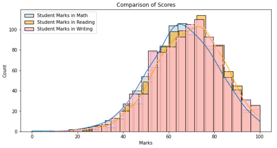
Let’s alter the transparencies of the histograms and add the kde density lines for better interpretation:
plt.figure(1, figsize=(10,5))

sns.histplot(data=df, x=df["math score"], label='Student Marks in Math',  alpha=0.2, kde=True)
sns.histplot(data=df, x=df["reading score"], label='Student Marks in Reading', color='orange', alpha=0.5,  kde=True)
sns.histplot(data=df, x=df["writing score"], label='Student Marks in Writing', color='pink', alpha=0.8,  kde=True)
plt.title("Comparison of Scores")
plt.xlabel("Marks")
plt.ylabel("Count")
plt.legend()
plt.show()
So, from the above plots, we can infer that the scores of all three exams follow more or less the same distribution.
Conclusion
The histogram is a really efficient tool for univariate data analysis. It is often called the “Unsung Hero of Problem-solving” because of its underutilization.
Seaborn is easier to customize and much more functional and organized than Matplotlib for basic plots.
Top Trending Articles:Data Analyst Interview Questions Data Science Interview Questions Machine Learning Applications Big Data vs Machine Learning Data Scientist vs Data Analyst How to Become a Data Analyst Data Science vs. Big Data vs. Data Analytics What is Data Science What is a Data Scientist What is Data Analyst
This is a collection of insightful articles from domain experts in the fields of Cloud Computing, DevOps, AWS, Data Science, Machine Learning, AI, and Natural Language Processing. The range of topics caters to upski... Read Full Bio


