Matplotlib Pie Chart – Shiksha Online
A pie chart is a circular statistical graphical chart, divided into slices that illustrate numerical proportions in data. For example, the pie chart below shows a simple monthly budget of this baker I know, where the total percentage is 100 and the total of the arc measures should be 360°.
In a pie chart, the central angle, area, and arc length of each slice are proportional to the quantity or percentages that it represents.
Python’s data visualization library – Matplotlib, provides support for many useful charts for creating cool visualizations. For this article, we’re going to focus on how Matplotlib is used to create and customize pie charts specifically, mostly because they sound delightful!
In this blog, we will be covering the following sections:
- Installing and Importing Matplotlib
- Creating a Matplotlib Pie Chart
- Adding Elements to the Pie Chart
- Parameters of the Pie Chart
- Saving your Pie Chart
- Endnotes
Matplotlib Pie Chart is used to visualize categorical data. We’ll understand how this is done through a fun example. The dataset used in this blog contains information on employees working for a company. We need to find out the percentage distribution of various job roles employees have in this company.
Let’s get started!
Installing and Importing Matplotlib
First, let’s install the Matplotlib library in your working environment. Execute the following command in your terminal:
pip install matplotlib
Now let’s import the libraries we’re going to need today:
import pandas as pdimport matplotlib.pyplot as plt%matplotlib inline
In Matplotlib, pyplot is used to create figures and change their characteristics.
The %matplotlib inline function allows for plots to be visible when using Jupyter Notebook.
Best-suited Python for data science courses for you
Learn Python for data science with these high-rated online courses
Creating a Matplotlib Pie Chart
Load the dataset
Prior to creating our graphs, let’s check out the dataset:
#Read the datasetdf = pd.read_csv('company.csv')df.head()
#Check out the number of columnsdf.shape()
There are 35 columns (or features) in this dataset. Let’s print them all:
#List all column names<strong>print</strong>(df.columns)
Based on our requirement, our focus is going to be on the JobRole column that lists the job roles of the employees working there.
Let’s use groupby operation to group the job roles in the JobRole column:
df.groupby(['JobRole']).mean()
We can see that there are 9 job roles given in the dataset. Now, let’s move ahead with analyzing this dataset through a pie chart.
Sorting the data
First, let’s sort the indices and counts for our JobeRole column:
label=df.JobRole.value_counts().indexcount=df.JobRole.value_counts().values
Plotting the data
Now, let’s plot a pie chart using the pie() function:
plt.pie(count,labels=label)
Although we can get a general idea of the distribution of the job roles through the above plot, we cannot extract any relevant information from the pie chart just yet.
Let’s see how we can customize this chart to help us interpret it better.
Adding Elements to the Pie Chart
The plot we have created would not be easily understandable to a third pair of eyes without context, so let’s try to add different elements to make it more readable:
- Use plt.title() for setting a plot title
- Use plt.legend() for the observation variables
- Use plt.show() for displaying the plot
plt.pie(count,labels=label)plt.title('Job Role Distribution')plt.legend()plt.show()
Parameters of the Pie Chart
Firstly, let’s enlarge our chart to view it clearly:
- We’ll specify the figsize parameter in the figure() function to set the dimensions of the figure in inches.
plt.figure(1, figsize=(20,10))plt.pie(count,labels=label)
The colours of this chart look a little dull, right? Let’s get this fixed:
- We’ll specify the colors parameter.
#There are 9 job roles so 9 colourscolor = ['#FA8F0A','#F0DA32','slateblue','#61F527','#18DE9D','#3594FF', 'orange', '#8B5A8C', 'g'] plt.figure(1, figsize=(20,10))plt.pie(count,labels=label, colors=color)
Let’s add the percentage division to each of the slices of the chart:
- The autopct parameter is used to label the wedges with their numeric value.
plt.figure(1, figsize=(20,10))plt.pie(count, labels=label, colors=color, autopct='%1.1f%%')plt.show()
This gives us the percentage distribution of various job roles employees have in this company.
Now, what are we want to specifically focus on the percentage of Research Scientists this company has employed?
- We can take out a slice from the pie with the explode parameter:
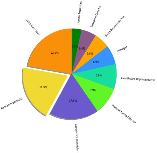
explode = (0, 0.1, 0, 0, 0, 0, 0, 0, 0) plt.figure(1, figsize=(20,10))plt.pie(count, labels=label, colors=color, autopct='%1.1f%%', explode=explode)plt.title("Percentage of Research Scientists",color="saddlebrown",fontsize=15)plt.show()
We also added the title to the above plot using the title() function and specifying its color and font size. Our chart is beginning to look quite attractive and professional, isn’t it?
Now, let’s beautify our pie chart some more: what are we want to specifically focus on the percentage of Research Scientists this company has employed?
- The shadow parameter casts a shadow beneath the pie.
- The startangle parameter rotates the start of the pie chart by angle degrees counterclockwise from the x-axis.
plt.figure(1, figsize=(20,10))plt.pie(count, labels=label, colors=color, autopct='%1.1f%%', explode=explode, shadow=True, startangle=90)plt.title("Percentage of Research Scientists",color="saddlebrown",fontsize=15)plt.show()
You can also rotate your chart labels:
- The rotatelabels parameter rotates each label to the angle of the corresponding slice if true.
plt.figure(1, figsize=(20,10))plt.pie(count, labels=label, colors=color, autopct='%1.1f%%', explode=explode, shadow=True, startangle=90, rotatelabels=True)plt.show()
You can also add axes to your chart:
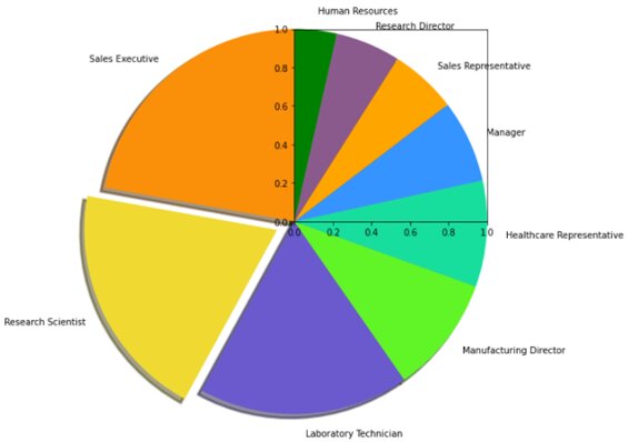
- The frame parameter plots axes frame with the chart if true.
plt.pie(count, labels=label, colors=color, explode=explode, shadow=True, startangle=90, frame=True)plt.show()
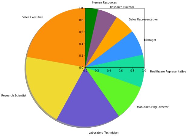
You can also change the width of your pie:
- The wedgeprops parameter sets the width of the wedge border lines.
plt.pie(count, labels=label, colors=color, explode=explode, shadow=True, startangle=90, frame=True, wedgeprops = {'linewidth':3})plt.show()
You can also change the radius of your pie:
- The wedgeprops parameter sets the width of the wedge border lines.
plt.pie(count, labels=label, colors=color, explode=explode, shadow=True, startangle=90, frame=True, wedgeprops = {'linewidth':3})plt.show()
Saving your Pie Chart
You can save your plot as an image using savefig() function. Plots can be saved in – .png, .jpeg, .pdf, and many other supporting formats.
Let’s try saving the ‘Percentage of Research Scientists’ plot we have created above:
fig = plt.figure(1, figsize=(20,10))plt.pie(count, labels=label, colors=color, autopct='%1.1f%%', explode=explode, shadow=True, startangle=90)plt.title("Percentage of Research Scientists",color="saddlebrown",fontsize=15)plt.show() fig.savefig('piechart.png')
The image would have been saved with the filename ‘piechart.png’.
To view the saved image, we’ll use the matplotlib.image module, as shown below:
#Displaying the saved imageimport matplotlib.image as mpimg image = mpimg.imread("piechart.png")plt.imshow(image)plt.show()
Endnotes
For comparing the relative importance of quantities, a pie chart almost always comes in handy. Even though this isn’t the favorite chart of the data visualization community, it does have its uses. Matplotlib is one of the oldest Python visualization libraries and provides a wide variety of charts and plots for better analysis. Interested in learning more about Data Visualization and Python? Explore related articles here:
Top Trending Articles:
Data Analyst Interview Questions | Data Science Interview Questions | Machine Learning Applications | Big Data vs Machine Learning | Data Scientist vs Data Analyst | How to Become a Data Analyst | Data Science vs. Big Data vs. Data Analytics | What is Data Science | What is a Data Scientist | What is Data Analyst
This is a collection of insightful articles from domain experts in the fields of Cloud Computing, DevOps, AWS, Data Science, Machine Learning, AI, and Natural Language Processing. The range of topics caters to upski... Read Full Bio


