Power BI Distribution Charts
Power BI is a set of software facilities, applications, and connectors that collaborate together to transform disparate data sources into coherent, visually immersive, and interactive insights.
Often you would want to visualize how the data is spread or distributed across a dataset. For example, you would want to know which are the most common values, the outliers, or how the data points are spread in general. Moreover, it’s good practice to know how data is distributed before you analyze it. In this article, we shall explore various Power BI Charts that help visualize the distribution of data.
Let’s get started!
List of Power BI Charts for Visualizing Data Distribution
Listed below are the charts that you can use to visualize the distribution of data in Power BI:
Please note that apart from those listed above, there are other Power BI data distribution charts such as heat maps, range charts, etc.
Histogram
A histogram is a very common plot that is used to visualize the distribution of data in a dataset. A histogram, in general, is a type of column chart. However, you should keep in mind that not all column charts are histograms. Histograms can be effectively used in different scenarios to provide useful insights. Let’s take a simple example to understand the concept.
In this example, let us visualize the influence of age on heart stroke. With this simple histogram visual, you can answer questions like “Which age group is most at risk for stroke?”, “probability of stroke in teenagers”, and many others. The important thing about a histogram is that the data shown is divided or grouped into categories called bins. You can decide the size of the bins based on your requirement.
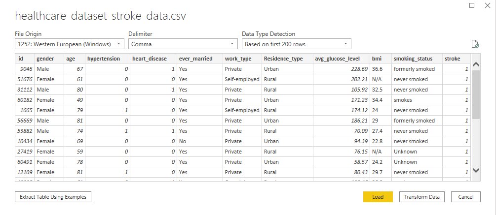
Here’s what the underlying data looks like:
We have the patient id, various other input parameters like gender, age, diseases, smoking status, and other relevant information about the patient. This dataset helps us predict if a patient is likely to get a stroke based on the above parameters. For this demo, we are just going to analyze the correlation between age with stroke. On Power BI Desktop, we can do this in multiple ways, like using a custom histogram visual or recreating a histogram using existing visuals like column charts or Python Visuals. Let’s take a look.
Method 1 – Using Custom Visual
Click on get more visuals as shown below and in the dialog box that opens search for a histogram.
In the next window that opens up, select the “Histogram Chart” visual by Microsoft. Click on visual for detailed information and then click on “Add”.
Once the visual is added to your visualization page, you get a message as shown below. Now you can use this visual like any other.
Now select the visual, drag the field whose distribution you want to visualize into the “Values” field and “Frequency” field. In our case, that would be age. However, for the age in the frequency field, what we want is the count of patients for each age group. Click on the dropdown under “Frequency” and change it to count.
That’s it, we have our histogram. Just that, the dataset we are using has a field called, stroke: 1 if the patient had a stroke or 0 if not. We will just need data from patients who had a stroke. So, select the histogram and add ‘stroke’ as a visual level filter in the filter pane. Unselect value 0 and just retain 1. The resulting histogram is what we need.
In the x-axis, the age bins are represented as decimal values, such as 1.32 to 10.28, 10.28 to 19.25, etc. We can change this in the visual setting. Select the visual, and go to formatting as shown below. Under x-axis and y-axis formatting actions, make decimal places as 0, and modify start and end parameters accordingly. Format the rest of the visual as per your needs.
Here’s the histogram!
Best-suited Power BI courses for you
Learn Power BI with these high-rated online courses
Dot Charts (Scatter Charts)
Scatter plots are very useful when you want to visualize the trends in distribution and relationships between two variables. It uses dots to represent the values for two different numeric variables and you can use it to show patterns, clusters, trends, and their relationship in both small and large datasets. Here’s a simple example to introduce the scatter plot in power bi.
We are going to use the same dataset as we used before. To begin, click on the Scatter Chart option in the visualizations pane.
You will see an empty chart box on the canvas. Through the scatter chart that we are creating, I want to visualize the relationship between the number of stroke patients, and their avg_glucose level based on age. Let’s create a measure to get the count of stroke patients.
Number of Stroke Patients =
CALCULATE (
COUNTROWS ( ‘healthcare-dataset-stroke-data’ ),
‘healthcare-dataset-stroke-data’[stroke] = 1
)
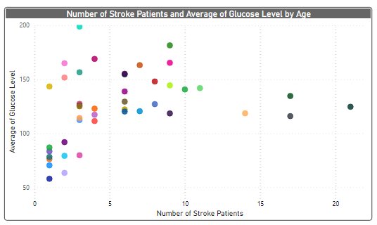
The next step is to populate the visualization arguments under the Fields option as shown below. Drag the measure created earlier to the x-axis, field avg_glucose level to the y-axis, and age to the details field. That’s the scatter plot.
Just one correction, the avg_glucose level in the y-axis is summed up instead of average. So, click on the dropdown menu and change it to Average.
This will create the scatter plot that we were aiming for with a little bit of formatting. Every dot on the graph shows Age, the number of stroke patients at that age, and an average of their glucose level.
You can opt for scatter charts to demonstrate the connection between two numerical quantities and when you are dealing with a medium-sized data set. Now if your chart is too big and you would want to summarize rather than have a data point for each value then you can go for a box or whisker chart.
Box and Whisker Charts
Box and Whisker plot is a convenient way to graphically demonstrate groups of numerical data through their quartiles. The box whisker plot allows you to see a number of things, such as outliers, different volumes of data between two extremes, clusters of data points, etc. In simple terms, a box whisker plot shows summary statistics as shown below:
Lower extreme and Upper extremer are nothing but min and max respectively. Then we have medium, which is the middle number in a sorted (ascending or descending) list of numbers. The lower quartile is simply the median for the last half of the data and the upper quartile is the median for the top half of the data.
Let’s go with the same dataset that we have been using till now. A box whisker plot is not available in Power BI as a default visual. So, you need to import the custom chart. For this demo, we will be using Box and Whisker chart by Jan Pieter.
Once the visual is added, you can just use it like any other visual. First, let’s explore the fields provided by this visual. In the Sampling field, let’s add “age”, then in the Values field, add the new measure called “Number of Patients Without Stroke” (DAX provided below). Lastly, in the category filed, let us add “smoking_status”.
Number of Patients Without Stroke =
CALCULATE (
COUNTROWS ( ‘healthcare-dataset-stroke-data’ ),
‘healthcare-dataset-stroke-data’[stroke] = 0
)
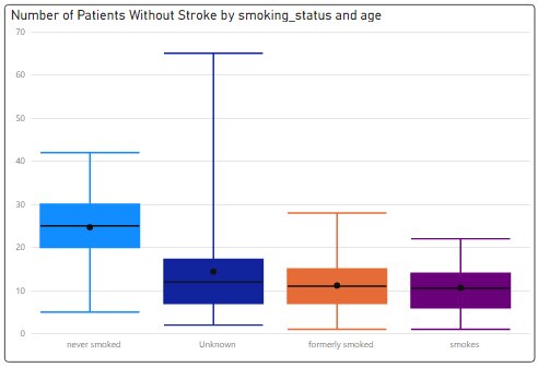
The box and whisker plot that we get is:
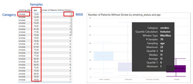
Now, the question is what is this data trying to depict? For that let’s take one category and try to understand it. Below we have the table view and the box whisker view.
We have 70 samples (which means 70 different values of age) for smoking_status “smokes”. Remember that we are considering people who didn’t get a stroke. The minimum value is 1, which indicates that, for the given sample, the minimum value of “Number of Patients Without Stroke” is 1 (We have a count value of 1 for age groups 10, 12, and 13). Similarly, the max count is 22, which you will be able to see if you scroll down in the table view of the data. Apart from that, we have medium and quartiles.
Under Format, there are several customizations that are available for the Box and Whisker charts. You have various chart options, data colors, gridlines, x & y axis formatting, and many other interesting options. I suggest you explore them to know about the chart in detail.
Conclusion
In this article, we have explored a set of Power BI charts that will help you to visualize the distribution of data points in a dataset. To be able to decide which chart suits your purpose you should understand the purpose of these charts in detail. The best way to do that is to practically experiment with them. We hope this article will help you to start. Happy learning!
Top Trending Tech Articles:Career Opportunities after BTech Online Python Compiler What is Coding Queue Data Structure Top Programming Language Trending DevOps Tools Highest Paid IT Jobs Most In Demand IT Skills Networking Interview Questions Features of Java Basic Linux Commands Amazon Interview Questions
Recently completed any professional course/certification from the market? Tell us what liked or disliked in the course for more curated content.
Click here to submit its review with Shiksha Online.
This is a collection of insightful articles from domain experts in the fields of Cloud Computing, DevOps, AWS, Data Science, Machine Learning, AI, and Natural Language Processing. The range of topics caters to upski... Read Full Bio


