ROC Curve in Machine Learning
In machine learning, the ROC curve is a graphical representation of the True Positive Rate against the False Positive Rate. It is a powerful tool for evaluating the performance of different classification models, to choose the best threshold for a given model, and to assess the overall quality of a model.
What is the ROC Curve in Machine Learning?
An ROC curve, (or receiver operating characteristic curve), in machine learning is a graph that shows the performance of a classification model at all classification thresholds. It is a popular and important metric for evaluating the performance of classification models, especially those used in medical diagnosis and fraud detection.
Must Read: AUC-ROC in Machine Learning
- The ROC curve is plotted with the True Positive Rate (TPR) on the y-axis and the False Positive Rate (FPR) on the x-axis.
- The TPR, also known as recall, is the percentage of positive cases that the model correctly identifies.
- TPR = TP/ (TP + FN), where TP: True Positive and FN: False Negative
- The FPR is the percentage of negative cases that the model incorrectly identifies as positive.
- FPR = FP / (FP + TN), where FP: False Positive and TN: True Negative
- A typical ROC curve looks like:
- The TPR, also known as recall, is the percentage of positive cases that the model correctly identifies.
- In simple terms, ROC curve provides the tradeoff between True Positive Rate and False Positive Rate at different threshold settings.
- The ROC curve for a perfect classifier would be a diagonal line from the bottom left corner to the top right corner.
- This means that the classifier would correctly identify all positive cases and no negative cases.
- The ROC curve for a random classifier would be a horizontal line at the 50% TPR mark.
- This means that the classifier would be similar to guessing which cases are positive and which are negative.


Note: The full form of the ROC curve is the Receiver Operating Characteristic curve.
Must Check: Top Online Machine Learning Courses and Certifications
Now, let’s take a dataset, to know how to implement and intrept the ROC curve.
To generate a random dataset, we will use sklearn.datasets.make_classification.
make_classification has many parameters, but here, we will use the following:
- n_samples: number of observations you want to generate.
- n_features: number of numerical features you want/ number of columns
- n_informative: number of useful features/if you set the n_informative value then, n-feature-n_inforamtive columns will be redundant.
- n_class: number of unique classes for the target variable.
- random_state: it ensures that the same randomization is used each time the code is executed, resulting in the same data splits.
Step-1: Generate the Dataset
#generate a random dataset using the sklearn.datasets.make_classification
from sklearn.datasets import make_classification
X, y = make_classification ( n_samples=3000, n_features=7, n_informative=5, n_classes=2, random_state= 28)
Step-2: create the data frame, and give name to columns
#create the dataframe, and name the columns
import pandas as pd
# Create DataFrame with features as columns
df = pd.DataFrame(X)
# give custom names to the features
df.columns = ['var1', 'var2', 'var3', 'var4', 'var5', 'var6', 'var7']
# Now add the label as a column
df['y'] = y
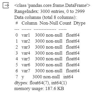
df.info()
Output
#show first 5 observation from the dataset
df.head()
Output
#check unique count in the target varaible
df['y'].value_counts()
Output
Step-3: split, train, fit the classifier and predict the probability
#split, train and fit the classifier
from sklearn.model_selection import train_test_splitfrom sklearn.linear_model import LogisticRegressionfrom sklearn.neighbors import KNeighborsClassifier
#split the dataset into training and testing set.#Split the dataset into 70% training set and 30% testing set
X_train, X_test, y_train, y_test = train_test_split(X, y, test_size=0.3, random_state=28)
#train the dataset on logistic regression and KNeighborsClassifier
lr = LogisticRegression(max_iter=500)knn = KNeighborsClassifier(n_neighbors=4)
#fit the model
lr.fit(X_train, y_train)knn.fit(X_train, y_train)
#predict probabilities
pred1 = lr.predict_proba(X_test)pred2 = knn.predict_proba(X_test)
Step-4: Compute ROC
#compute the ROC
from sklearn.metrics import roc_curve
fpr1, tpr1, thresh1 = roc_curve(y_test, pred1[:,1], pos_label=1)fpr2, tpr2, thresh2 = roc_curve(y_test, pred2[:,1], pos_label=1)
#ROC curve for TPR=FPRrandom_probs = [0 for i in range(len(y_test))]p_fpr, p_tpr, _ = roc_curve(y_test, random_probs, pos_label=1)
Step-5: Draw the ROC Curve
#Draw the ROC curve
import matplotlib.pyplot as pltimport seaborn as sns%matplotlib inline
plt.plot(fpr1, tpr1, linestyle='--',color='orange', label='Logistic Regression')plt.plot(fpr2, tpr2, linestyle='--',color='green', label='KNN')plt.plot(p_fpr, p_tpr, linestyle='--', color='blue')#titleplt.title('ROC curve')#x-labelplt.xlabel('False Positive Rate')#y-labelplt.ylabel('True Positive rate') plt.legend(loc='best')plt.savefig('ROC',dpi=300)plt.show();
Output
Explanation
Now, from the above ROC curve, we can easily depict that for KNN the Area Under the Curve is greater than that for the Logistic Regression curve. In simple terms, we can conclude that the KNN is better at classifying the positive class from the dataset than logistic regression.
Recommended Reads


