AUC-ROC in Machine Learning
In machine learning, AUC-ROC is a key metric for assessing model accuracy, especially in binary tasks. It gauges a model’s ability to differentiate between classes. Explore to understand its importance.
In Machine Learning, a critical task after building a model is to evaluate the performance of that model. The metrics that measure the model’s predictive accuracy vary depending on the type of the model. This article will discuss the AUC-ROC metrics used for the performance measurement of classification models, especially binary classifiers.
Before we proceed, I would suggest you take some time out and go down the article on Confusion Matrix to understand some of the important terms that will be used in this article.
Today, we will be covering the following topics:
- What is ROC?
- What is AUC?
- The Relation between Sensitivity, Specificity, and Threshold
- Why Use AUC-ROC Curve?
- Demo: How to plot AUC-ROC Curve using Python?
- Endnotes
What is ROC?
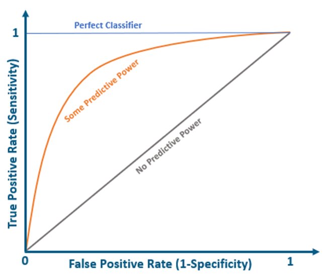
The Receiver Operating Characteristics Curve, aka the ROC Curve, is an evaluation metric used for binary classification problems. ROC is a probability curve that depicts the TPR (rate of true positives) on the y-axis against the FPR (rate of false positives) on the x-axis. It essentially distinguishes the ‘signal’ from the ‘noise’, thereby highlighting the Sensitivity of the classifier model.
The graph below demonstrates theoretically how the ROC curve would be plotted for a classifier model. A perfect classifier will have a ROC where the graph would hit a true positive rate of 100% with zero false positives. The grey diagonal line represents a classifier with no predictive power – one that guesses randomly
Nearly all real-world classifiers would fall between these two extremes – having some predictive power. Generally, we look for a classifier that maintains a high TPR while also low FPR.
ROC Curves help determine the exact trade-off between the TPR and FPR for a classifier using different measures of probability thresholds.
Also read: HOW TO EVALUATE MACHINE LEARNING MODEL
Also read: HOW TO IMPROVE MACHINE LEARNING MODEL
Best-suited Machine Learning courses for you
Learn Machine Learning with these high-rated online courses
What is AUC?
Area Under the Curve, aka the AUC, is another important evaluation metric generally used for binary classification problems. AUC represents the degree of separability. The higher the AUC, the better the classifier can distinguish between the positive and negative classes.
The graph below demonstrates the area under the curve. AUC is used to summarize the ROC Curve as it measures the entire 2D area present underneath the ROC curve.
The value of AUC ranges from 0 to 1. If AUC=1, the model can distinguish between the Positive and the Negative class points correctly.
Similarly, a model with 100% false predictions, i.e., predicting all Negatives as Positives, and all Positives as Negatives, would have AUC=0.
When an AUC=0.5, it means the model possesses no class separation capacity and cannot distinguish between the Positive and Negative class points.
The Relation between Sensitivity, Specificity, and Threshold
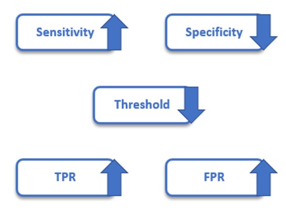
The Sensitivity and Specificity of a classifier are inversely proportional to each other. So, when Sensitivity increases, Specificity decreases, and vice versa.
We already know that FPR = 1 – Specificity. So, when Sensitivity (TPR) increases, FPR will also increase, and vice versa.
The choice of the threshold value depends on the ability of the AUC-ROC curve to balance between False positives and False negatives. With an increase in the threshold, the positive and negative values would increase as well, thereby increasing the Sensitivity and decreasing the Specificity.

Why Use AUC-ROC Curve?
They help us compare the performance of different classifiers for the same problem.
They also help us determine a classification threshold that suits our specific problem. For instance, if our classifier predicted a disease, we would allow many false positives (misdiagnosing an illness), only to ensure that no true positives (correctly diagnosed patients) were missed out.
On the other hand, if a classifier detected spam emails, you wouldn’t want to lose an important email. So, we would allow even true positives (actual spam emails) through the filter to ensure that no important emails were lost in the spam folder.
Normal
0
false
false
EN-US
X-NONE
X-NONE
Must Check: What is Machine Learning?
Must Check: Machine Learning Online Courses & Certification
How to Plot AUC-ROC Curve Using Python?
Problem Statement:
Build a classifier model that can predict whether a patient has breast cancer or not based on the features provided in the given dataset.
Here, we will use two classification algorithms, namely, Logistic Regression and K Nearest Neighbors, using Python’s scikit-learn library. We will be computing their AUC and ROC and obtaining the AUC-ROC curve.
So, let’s get started!
Dataset Description:
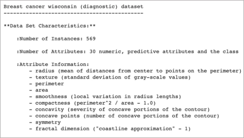
We will make use of the breast_cancer dataset already present in the scikit-learn library.
Here is a preview of the dataset (the full description is too long to include):
The target column is used to predict whether the tumor is cancerous or not.
Tasks to be performed:
1) Load the data
2) Split the data into training and testing sets
3) Train the classifiers: Logistic Regression and KNN
4) Fit the classifiers and calculate the prediction probabilities
5) Compute the ROC
6) Compute the AUC
7) Obtain the AUC-ROC curves
1 – Load the data.
import pandas as pdimport numpy as npimport matplotlib.pyplot as pltfrom sklearn.datasets import load_breast_cancer #Load the breast cancer datasetX, y = load_breast_cancer(return_X_y=True)
2 – Split the data into training and testing sets.
from sklearn.model_selection import train_test_split#Split the dataset into 70% training set and 30% testing setX_train, X_test, y_train, y_test = train_test_split(X, y, test_size=0.3, random_state=23)
3 –Train the classifiers
We are going to train both – Logistic Regression and KNN classifier models:
from sklearn.neighbors import KNeighborsClassifier #Logistic regression clf1 = LogisticRegression(max_iter=1000) #KNNclf2 = KNeighborsClassifier(n_neighbors=4)
4 – Fit the classifiers and calculate the prediction probabilities.
#Fit the classifiersclf1.fit(X_train, y_train)clf2.fit(X_train, y_train) #Predict the probabilitiespred_prob1 = clf1.predict_proba(X_test)pred_prob2 = clf2.predict_proba(X_test)
5 – Compute the ROC
The roc_curve() method will compute the ROC for your classifiers within seconds and return the FPR, TPR, and threshold values:
from sklearn.metrics import roc_curve #ROC curve for classifiersfpr1, tpr1, thresh1 = roc_curve(y_test, pred_prob1[:,1], pos_label=1)fpr2, tpr2, thresh2 = roc_curve(y_test, pred_prob2[:,1], pos_label=1) #ROC curve for TPR=FPRrandom_probs = [0 for i in range(len(y_test))]p_fpr, p_tpr, _ = roc_curve(y_test, random_probs, pos_label=1)
6 – Compute the AUC
The roc_auc_score() method will compute the AUC score:
from sklearn.metrics import roc_auc_score #AUC scoresauc_score1 = roc_auc_score(y_test, pred_prob1[:,1])auc_score2 = roc_auc_score(y_test, pred_prob2[:,1]) print("Logistic Regression AUC Score:", auc_score1) print("KNN AUC Score:", auc_score2)
7 – Obtain the AUC-ROC Curves
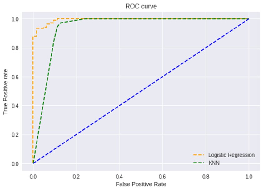
Let’s plot the AUC-ROC curves for both the algorithms using the matplotlib library:
#Plot roc curvesplt.plot(fpr1, tpr1, linestyle='--',color='orange', label='Logistic Regression')plt.plot(fpr2, tpr2, linestyle='--',color='green', label='KNN')plt.plot(p_fpr, p_tpr, linestyle='--', color='blue')#titleplt.title('ROC curve')#x-labelplt.xlabel('False Positive Rate')#y-labelplt.ylabel('True Positive rate') plt.legend(loc='best')plt.savefig('ROC',dpi=300)plt.show();
Endnotes
We have discussed how AUC-ROC is used to evaluate the performance of classification algorithms in machine learning. If you found this article helpful, kindly comment below with your feedback or queries.
Artificial Intelligence & Machine Learning is an increasingly growing domain that has hugely impacted big businesses worldwide—interested in being a part of this frenzy?
FAQs
What is ROC in machine learning?
The Receiver Operating Characteristics Curve, aka the ROC Curve, is an evaluation metric used for binary classification problems. ROC is a probability curve that depicts the TPR (rate of true positives) on the y-axis against the FPR (rate of false positives) on the x-axis. It essentially distinguishes the u2018signalu2019 from the u2018noiseu2019, thereby highlighting the Sensitivity of the classifier model.
What is AUC?
Area Under the Curve, aka the AUC, is another important evaluation metric generally used for binary classification problems. AUC represents the degree of separability. The higher the AUC, the better the classifier can distinguish between the positive and negative classes.
What is the relation between sensitivity and specificity?
The Sensitivity and Specificity of a classifier are inversely proportional to each other. So, when Sensitivity increases, Specificity decreases, and vice versa.
Why use AUC-ROC curve?
They help us compare the performance of different classifiers for the same problem. They also help us determine a classification threshold that suits our specific problem. For instance, if our classifier predicted a disease, we would allow many false positives (misdiagnosing an illness), only to ensure that no true positives (correctly diagnosed patients) were missed out. On the other hand, if a classifier detected spam emails, you wouldnu2019t want to lose an important email. So, we would allow even true positives (actual spam emails) through the filter to ensure that no important emails were lost in the spam folder.
This is a collection of insightful articles from domain experts in the fields of Cloud Computing, DevOps, AWS, Data Science, Machine Learning, AI, and Natural Language Processing. The range of topics caters to upski... Read Full Bio


