In this article, we will see how Reshma uses PyCaret for classification, regression, and clustering algorithms.
In Data Science, training models is a really hectic job. Constantly, training the same set of models to determine which model to use takes a lot of time. Here, we will discuss the case of Reshma, a Data Scientist. Her job is to train and tune models for the projects. This repetitive process has gotten tiresome and inconvenient for her. But, now she is using a new library PyCaret to train and test machine learning models.
PyCaret is a low-code library that enables her to easily train and compare a list of models at once. With PyCaret she can also maintain the model training history and save models. This helps her to keep track of her experiments and reduces most of her efforts.
Since PyCaret is a low-code library, you won’t have to keep writing huge scripts to create, train, and tune models during your experimentation phase. With just a couple of lines, you can create, tune and test your model.
Recommended online courses
Best-suited Machine Learning courses for you
Learn Machine Learning with these high-rated online courses
From the above plot, we can say that employees in China did the most purchases.
Let’s see what type of purchases made by people with different genders:
# Kind of products bought by different genders: gcat=purchase.groupby(['Category','gender']).Price.sum().unstack() fig=px.bar(gcat,y=list(purchase.gender.unique())) fig_list=[] # Now we have to create a list of bar charts genders=gcat.index for cat in purchase.gender.unique(): fig_list.append(go.Bar(name=cat, x=genders, y=gcat[cat])) fig=go.Figure(data=fig_list) # Change the bar mode fig.update_layout(barmode='stack') fig.show()
Copy code
Reshma then creates a plot to see the number of employees around the globe in different departments:
type_employees=details.groupby(['country','department']).department.count().unstack().fillna(0)# create figure fig = go.Figure() # Add surface trace fig.add_trace(go.Choropleth(locations = type_employees.index,z=type_employees['Accounting'], locationmode='country names',text = type_employees.index,colorscale = 'brbg',autocolorscale=False, reversescale=True,marker_line_color='darkgray',marker_line_width=0.5,colorbar_tickprefix = '', colorbar_title = '#Employees',)) # Add buttons to change columns buttons_list=[] go.Surface() for col in type_employees.columns: buttons_list.append(dict(args=[ {'z':[list(type_employees[col].values)]}] ,label=col,method="restyle")) # Add dropdown fig.update_layout(updatemenus=[ dict(buttons=buttons_list,direction="down",pad={"r": 10, "t": 10}, showactive=True,x=0.1,xanchor="left", y=1.1,yanchor="top")]) # Set title and basic map adjustments fig.update_layout( title_text='# Employees around the globe', geo=dict( showframe=True, showcoastlines=False, projection_type='equirectangular' )) fig.show()
Copy code
There is more to explore in the data, you can explore the data by yourself or check the notebook attached.
Classification
For classification, Reshma will be using the customer details to classify which department they belong to:
Setup
To start with pycaret you just have to invoke a simple setup function:
It will automatically take the important variables and will prompt you for further process. After the setup process is executed it will give all the information related to the pipeline for pre-processing. It shows how the variables will be encoded, transformed and how many folds will be done. The session-id parameter is just taken for reproduction at later stages.
Comparing Models
Let’s train the models now:
best = compare_models()
Copy code
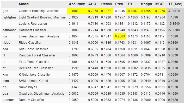
After executing the single line, you will see the below output. Just wait for it to finish training all the models:
When the process is completed it will show best results in highlighted manner:
As you can see that the accuracy is low. But, what can be the reason? There are multiple factors:
Lack of data
High Cardinality of label variable
Lack of features
Tuning Model
Moving forward, let’s take lightbgm as our model and tune the model. Before that let’s create the model:
best = compare_models()
Copy code
To tune the model, you just need one simple function:
class_best=tune_model(class_best)
Copy code
The output will be:
From the above output, you can see that there was a minor change in accuracy and AUC score.
Plotting Model
We can even plot the model output using pycaret:
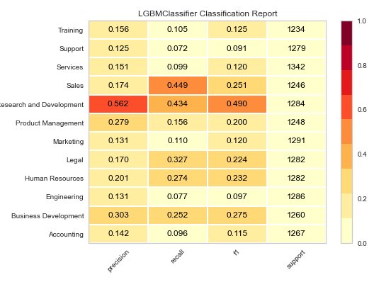
plot_model(class_best, plot ='confusion_matrix')
Copy code
As you can see that model is able to classify Research and Development well enough but for other categories its all over the place. We can try reducing number of departments for better accuracy. By changing attribute plot to class_report, you can get the classification report or to error for an error plot.
Since the model is performing badly we cannot move further. Let’s see how regression and clustering can be applied.
Regression
The process is similar as we did in classification:
from pycaret.regression import* reg_setup = setup(reg_data,target='Price')
Copy code
After setup it will return the similar format and tell you what will done in pre-processing. This time will select top3 models while comparing:
You can also stack or blend models in pycaret easily. Blending and Stacking are common techniques for ensembling in machine learning. Let’s see how Reshma does this:
At last, Reshma decides to use clustering of data. She merges both the dataframe and follows a similar approach to find the best working model. But instead of comparing models this time she only creates two models. The below figure shows which clustering algorithms are supported by PyCaret:
We can see the scores for the models and now we have to assign the cluster labels:
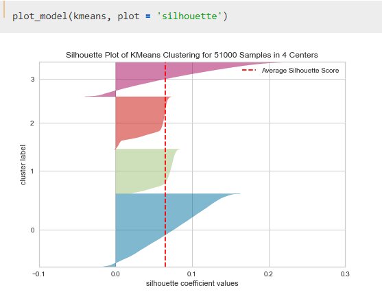
With a simple function, this is quite fast. At the end, Reshma plots the models:
Similarly, you can get a different kinds of plots like distribution, silhouette, elbow, and PCA2 plot. You can check the notebook for more examples of plots.
Saving and Loading Model
You can also save the model using save_model and load_model functions:
Saving Model:
save_model(kmeans,'kmeans.model')
Copy code
Loading Model:
model=load_model('kmeans.model')
Copy code
MLFlow UI
With PyCaret 2.0 MLFlow Tracking component comes as a backend API and UI for logging metrics, parameters, code version, and output files for easy access to the result later. You can start the server either from jupyter or console:
For jupyter simply use the magic:
!mlflow ui
Copy code
The server starts at localhost:5000
Conclusion
With simple to use and very low code, Reshma was able to run 20+ algorithms. With this, she can not only save her time but can also automate several steps. All she has to do is compare the results and decide on the model.
This is a collection of insightful articles from domain experts in the fields of Cloud Computing, DevOps, AWS, Data Science, Machine Learning, AI, and Natural Language Processing. The range of topics caters to upski... Read Full Bio


Comments
(1)
N
5 months ago
Report
Reply to Nisha Rani