Funnel Chart in Tableau
In this article we will discuss one of the type of chart in tableau i.e. Funnel Chart in Tableau with an example.
Introduction
In this article, we will discuss the Funnel chart in the tableau.
Tableau is a data visualization tool that allows drawing different charts and graphs using Show me with just simple drag and drop.
Tableau Show Me has 24 different charts.
Each chart in the tableau corresponds to a minimum number of dimensions, measures, bins, etc.
Best-suited Tableau courses for you
Learn Tableau with these high-rated online courses
Table of Content
What is a Funnel Chart?
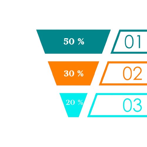
The name of the Funnel chart came because of its funnel (a pipeline) like shape. Data is represented in various stages. It shows a progressive reduction of the data as it passes from one phase to another, i.e., the number of data in the first stage is highest and decreases as it moves to the next step.
These graphs are mainly used by the marketing and sales teams to track the growth or deficit records. It describes a sales funnel that measures the number of customers at each stage in the sales pipeline.
Example: A sales team of the loss-making company shows the total contribution of sales in the first 3 quarters as
| Quarter ( 3months) | Sales (%) |
| First | 50 % |
| Second | 30 % |
| Third | 20 % |
Let’s understand how to create a Funnel Chart in Tableau with an example


Steps to create a Funnel Chart
We want to show category-wise profit using Funnel Chart.
- Connect a file (here, we will use Sample Super Store data)
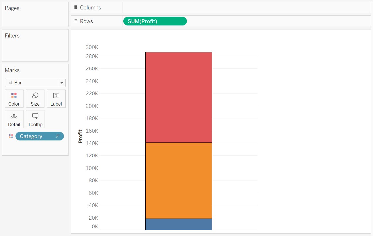
- Drag and drop Profit in row shelf.
- Drag and drop Category into color in Mark pane
- Arrange into Ascending order
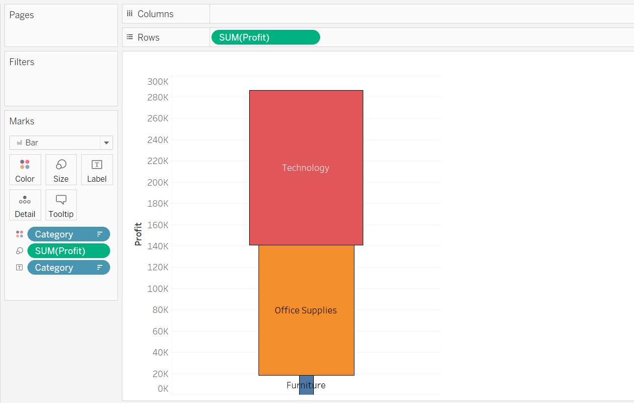
- Drag and drop Profit into size in the Mark pane
- Drag and drop Category into Label in the Mark pane
- We get the desired Funnel chart


Conclusion
In this article, we have discussed the Funnel Chart in Tableau with an example.
Hope this article will help you in your data/business analyst journey.
This article is a part of a complete tutorial on Tableau, focusing on Tableau certified data analysts and tableau desktop specialists.
Through a series of articles, we will cover all the topics in-depth with examples.
Top Trending Articles:
Data Analyst Interview Questions | Data Science Interview Questions | Machine Learning Applications | Big Data vs Machine Learning | Data Scientist vs Data Analyst | How to Become a Data Analyst | Data Science vs. Big Data vs. Data Analytics | What is Data Science | What is a Data Scientist | What is Data Analyst


