Outliers: Definition and Examples in Python
Introduction
In this article we will learn about one of the most important techniques used in building machine learning projects, handling outliers in the dataset. This article is all about outliers: definition and examples in python.
From the above figure, we have:
- The average weight of the first 4 kids were only 38.75 kg
- The average weight of all kids are 91 kg
Adding the weight of 300 kg shoots the average weight from 38.75 kg to 91 kg.
In statistics, this is called an Outlier.
Best-suited Machine Learning courses for you
Learn Machine Learning with these high-rated online courses
Table of Content
Outlier
An outlier is a value in the data set that is extremely distinct from most of the other values.
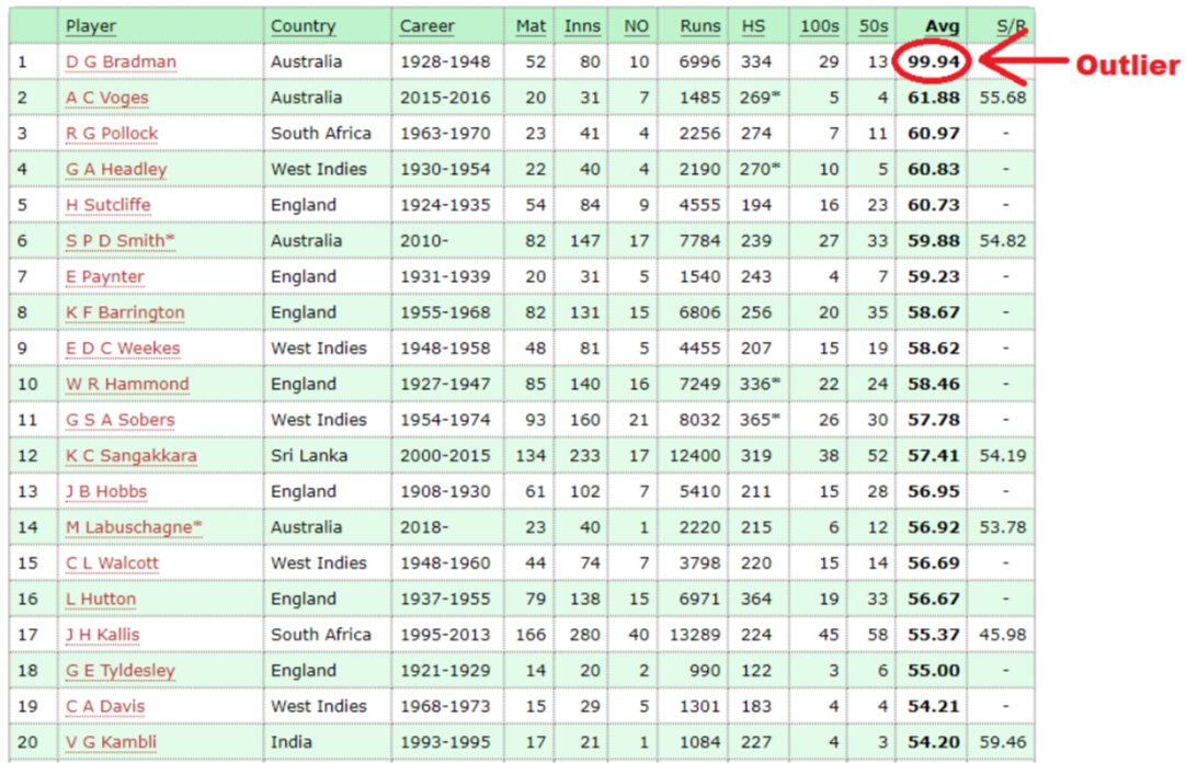
Let’s understand the outliers by an example of cricket
Highest Batting average of players in Test Cricket:
In the above table, the batting average of the DG Bradman is 99.64, while the batting averages of all remaining is between 54-62.
So, the batting average of DG Bradman is an outlier in the above list.
An outlier in the data is due to
- Variability in the data
- Experimental Error
- Heavy skewness in data
- Missing values
Detecting Outliers:
- Box-Plot
- Inter-quartile Range
- Z-score
Box-Plot
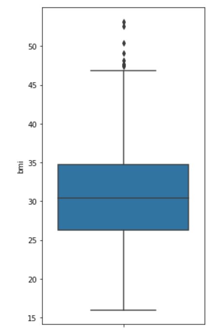
It is one of the data visualization methods, where the data is distributed on a box and whisker (also known as box-whisker-plot).
- Data points are divided into 4 different quartiles.
- Box-plot marks Maximum, Minimum, lower quartile (Q1), median (Q2) and upper quartile (Q3).
- Points outside the whisker are Outlier.
Let’s understand by an example in python:
Note: in this article, we are using the insurance.csv file for all of our examples.
Data has 7 features age, sex, BMI, number of children, smoker, region and their expenses of 1338 people.
Dataset is present on Kaggle.
# import library:import numpy as npimport pandas as pdimport matplotlib.pyplot as pltimport seaborn as sns # import sales datainsurance = pd.read_csv('insurance.csv')insurance #used to get summary statisticsinsurance.describe() #plotting the figureplt.figure(figsize = (4,8))sns.boxplot(y = insurance.bmi)
The value lies extremely outside the whisker of the box plot which is an outlier.
Interquartile Range (IQR):
All the data points that are above and below 1.5 times of Interquartile Range is considered as an outlier.
To know more about the IQR, read the article on……
Steps to find outcome using IQR:
- Arrange the data orderly (ascending)
- Compute IQR = Q3 – Q1
- Calculate bound (upper and lower) 1.5 IQR
- Any point outside the upper and lower bound are the outlier.
Let’s understand by an example:
# import library:import numpy as npimport pandas as pdimport matplotlib.pyplot as pltimport seaborn as sns # import sales datainsurance = pd.read_csv('insurance.csv')insurance # defining the outlier function for interquartile rangedef outlier_IQR(df, column): global lower, upper Q1 = np.quantile(df[column], 0.25) # first quartile Q3 = np.quantile(df[column], 0.75) # third quartile IQR = Q3 - Q1 # inter - quartile range threshold = 1.5 * IQR # defining the threshold lower = Q1 - threshold upper = Q3 + threshold lower_bound = df[df[column] < lower] upper_bound = df[df[column] > upper] #printing IQR, threshold, lower bound, upper bound and total number of outlier print('IQR is:', IQR) print('Threshold is:', threshold) print('Lower bound is:', lower) print('Upper bound is:', upper) return print('total number of outliers are:', lower_bound.shape[0] + upper_bound.shape[0]) # getting the IQR, threshold, lower bound, upper bound, total outliersoutlier_IQR(insurance, 'bmi') # plotting figureplt.figure(figsize = (10,8))sns.distplot(insurance.bmi, bins = 25) # creting band to identify the outliers# plt.axvspan : function sets the vertical rectangle across the axes of the plotplt.axvspan(xmin = lower, xmax = insurance.bmi.min(), alpha = 0.2, color = 'red')plt.axvspan(xmin = upper, xmax = insurance.bmi.max(), alpha = 0.2, color = 'red')
The red strip on both the sides of the curve indicates the outliers in bmi.
Z-score:
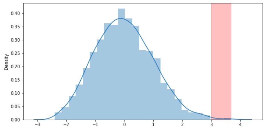
In a normal distribution, any data point whose z-score is outside the 3rd standard deviation is an outlier.
Z-score formula:
To know more about Normal Distribution and z-score, read the article Probability Distribution and z-test.
Let’s understand by an example:
# import library:import numpy as npimport pandas as pdimport matplotlib.pyplot as pltimport seaborn as sns # import sales datainsurance = pd.read_csv('insurance.csv')insurance # defining the outlier function for interquartile rangedef outlier_zscore(df_column): global outlier, z_score outlier = [] z_score = [] threshold = 3 mean = np.mean(df_column) std = np.std(df_column) for i in df_column: zscore = (i - mean)/std z_score.append(zscore) if np.abs(zscore) > threshold: outlier.append(i) return print("total number of outliers", len(outlier)) # getting total number of outlieroutlier_zscore(insurance.bmi) # plotting figureplt.figure(figsize = (10,5))sns.distplot(z_score) # creting band to identify the outliers# plt.axvspan : function sets the vertical rectangle across the axes of the plotplt.axvspan(xmin = 3 ,xmax = max(z_score),alpha = 0.25, color ='red')
The red strip on the right side of the curve indicates the outlier in bmi of the insurance data.
To know more about Matplotlib and seaborn, read the article on Matplotlib Pie Chart.
Conclusion
In this article we will discuss how to detect the outlier in the dataset using Boxplot, IQR and z-score.
Hope this article will help you in your data science journey.
Top Trending Articles:
Data Analyst Interview Questions | Data Science Interview Questions | Machine Learning Applications | Big Data vs Machine Learning | Data Scientist vs Data Analyst | How to Become a Data Analyst | Data Science vs. Big Data vs. Data Analytics | What is Data Science | What is a Data Scientist | What is Data Analyst

Vikram has a Postgraduate degree in Applied Mathematics, with a keen interest in Data Science and Machine Learning. He has experience of 2+ years in content creation in Mathematics, Statistics, Data Science, and Mac... Read Full Bio


