
Power BI Relationship Charts
Analyzing and visualizing items in your dataset one at a time is not enough. To showcase powerful untold insights and make meaningful conclusions, you need to understand how the entities in the dataset interact with each other, visualize the relationship between them, and the weightage of that relationship. There are various visualization techniques available in the industry to deal with this complex world of relationships. In this article, let us explore a few such Power BI relationship charts.

Power BI Relationship Charts
There are various visualization techniques available in the industry to deal with this complex world of relationships. In this article, let us explore a few such Power BI relationship charts.
Also read: Data Visualization with Power BI
Chord Chart
A chord diagram is one of the most common graphical methods of displaying the inter-relationship between different entities in a dataset. In geometry, a chord is a line that connects two points on a curve.
In this chart, each data category has a chord that is either connected to other categories or itself, which allows for an easy representation of correlated data. For every connection between categories, a value is assigned that is proportional to the size of the arc that connects entities. This is what a chord chart looks like. Let us now learn how to develop this chord diagram with the help of a real-life dataset.
The remittance inflow dataset published by the World Bank provides estimates of historical remittance money inflow into world countries since 1970 (typically high in developing countries). The values are in terms of million USD. We are going to use this dataset in the demo and get a few useful insights from the chord diagram.
Note: For the sake of the demo, I have reduced the dataset to the top 25 countries in terms of remittance inflow from 2010 to 2017.

Step 1: Click on get more visuals as shown below and in the dialog box. It opens a search for a chord diagram.

Step 2: Select “Chord” visual by Microsoft.

Step 3: Now import the data from the source to Power BI. And do a little bit of transformation so that your data is in the given format.

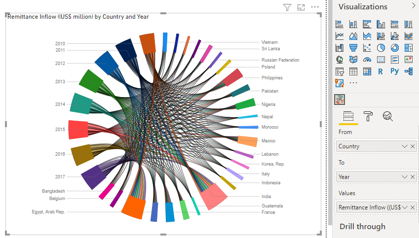
Step 4: Next, click on the Chord diagram, add ‘country’ to the From field, ‘year’ to the To field, and ‘remittance inflow’ to the values field. The result is the following chord diagram, which shows the remittance inflow.
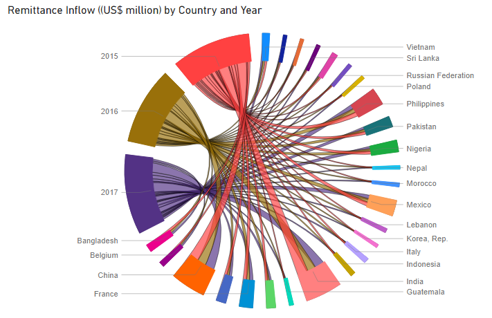
Step 5: Let us apply a filter on year and consider remittance inflow for the years 2015, 2016, and 2017 to get a clear picture. In the below chart, the three big arcs represent the total inflow for that year. The other arcs represent the total inflow for each of the countries for 3 years. The arcs connecting the year and the country show the inflow for each country by year.
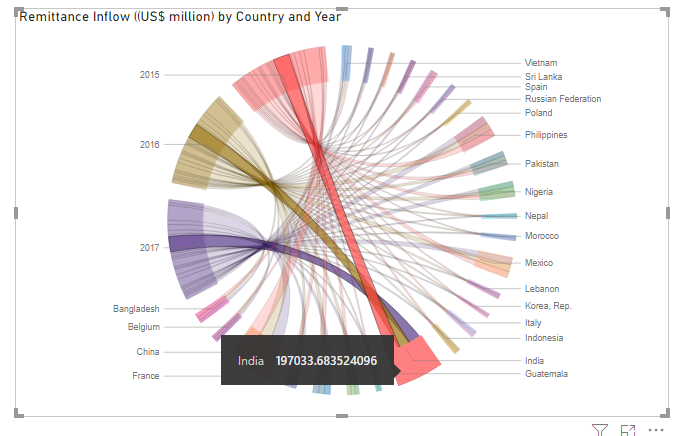
Step 6: Let us now see what points we can infer from this chart. You can see that India has the maximum inflow, followed by China, the Philippines, and others. If you compare you will find that the remittance inflows are almost similar in all the three fiscal years. You can click on any of those arcs to highlight the data that you want to see.

You can format the graph further in the way you want to get useful information from it.
Also, Read: Power BI Distribution Charts
Best-suited Power BI courses for you
Learn Power BI with these high-rated online courses

Network Navigator
Network navigator by Microsoft is another chart that lets you find the links and represent the complex relationships between different attributes in a dataset. It is an open-source visual. That automatically detects the relationship between categories (nodes) and offers rich customization options so that you can control the look of each category. You can set source nodes, and target nodes, assign colors to your nodes, and weight to the edges that connect the node. The chart also allows you to explore node-link data by zooming in. You can also use the search option to enlarge the data entity that you are searching for. However, when you have a very large dataset, the visual takes a lot of time to process and animate the relationship between all nodes.
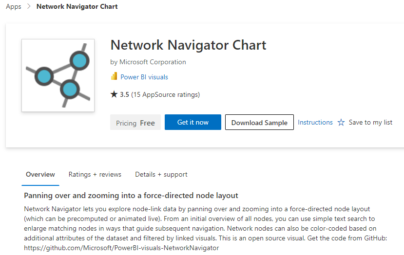
You can use a network navigator to showcase the relationships between data attributes of your dataset in a very appealing format.
Also, Read: Power BI Comparison Charts
There are plenty of other visuals such as Force-Directed Graph, Social Network Chart, Network Visualization, and others out there. That you can use to visualize patterns and represent complex links between entities. The best way to master them is by understanding the purpose of the visual and experimenting with it.
Conclusion
That’s it, guys! There are multiple other relationship charts out there that can be used to visualize the relationship between variables. It’s important to know how to use different visuals so that you build dashboards that make an impact. I hope that this article will help you get started on this topic.
Top Trending Tech Articles:Career Opportunities after BTech Online Python Compiler What is Coding Queue Data Structure Top Programming Language Trending DevOps Tools Highest Paid IT Jobs Most In Demand IT Skills Networking Interview Questions Features of Java Basic Linux Commands Amazon Interview Questions
Recently completed any professional course/certification from the market? Tell us what liked or disliked in the course for more curated content.
Click here to submit its review with Shiksha Online.

This is a collection of insightful articles from domain experts in the fields of Cloud Computing, DevOps, AWS, Data Science, Machine Learning, AI, and Natural Language Processing. The range of topics caters to upski... Read Full Bio