Time Series Analysis: An Introduction to Forecasting
Have you ever thought about how the big FMCG (Fast Moving Consumer Goods) companies like HUL or P&G plan for the next quarter’s sales or next week’s sales? Or how does Maruti forecasts the amount of raw material in terms of steel or paints for car production and assembly would be required during the next month? or how Walmart maintains the desired level of inventory across its 1,42,000 stores all over the world; so that the next time a customer walks across the aisle he/she doesn’t find the diaper section empty or the baby food section is short of products.
Fortunately, they have a tool called “Time Series Analysis” to understand and forecast the expected levels of sales forecast or raw material requirements.
In simple words, Time Series Analysis (TSA) is defined as a basic tool for forecasting. Forecasting is by far one of the most important aspects of business analytics and machine learning with a plethora of real-life use cases in the industry impacting both the top and bottom line (revenue and cost) of balance sheets of big corporations.
Definition of time series
A time series is nothing but a sequence of various data points or observations (Sales, demands, stock price, and so on) that occurred in consecutive order for a given period of time.
Best-suited Machine Learning courses for you
Learn Machine Learning with these high-rated online courses
Why is time series analysis important?
As discussed already time series finds its major application in the world of forecasting. You need to have some idea about the future in order to plan your today and that’s the backbone of the time series applications across the different industries. An analysis of the trend of the observations is needed to acquire an understanding of the progress of events leading to prevailing conditions.
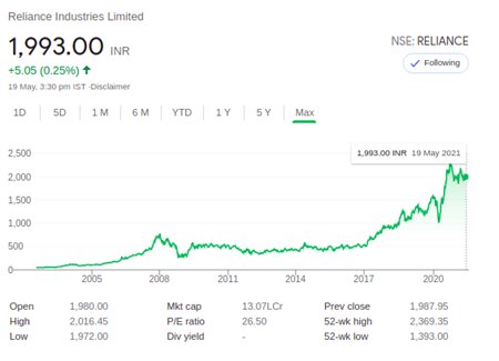
Example of time series (Share price movement)
The above example portrays the movement of the stock price for Reliance Industries over the last 15 years or so. This is a classic example of time series visualization. As can be observed over the course of the last 15 years the stock price of this company has almost quadrupled. Considering this stock price for the last 5 to 10 years and also taking into consideration the different seasonal and cyclical aspects of the stock price movement (periodic ups and downs) we can further forecast the future stock price and based on that can make a choice on investment.
Components of a time series
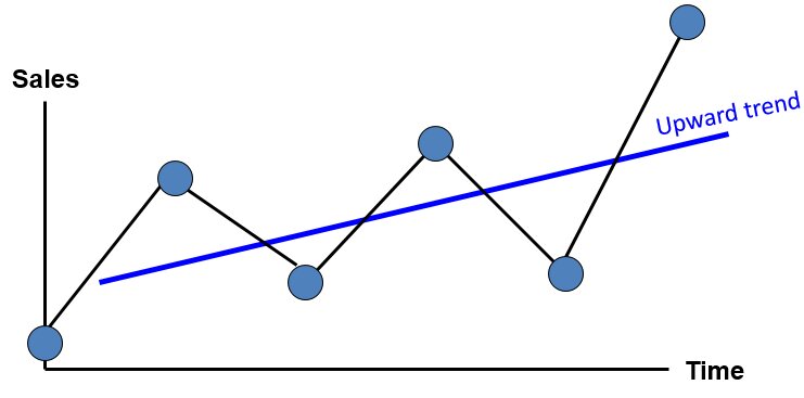
Trend: Trend is the constant upward or downward movement of the Time series data. In economic terms, the length to observe a trend should be >=10 years.
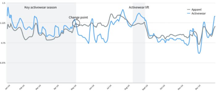
Seasonality: Seasonality or seasonal component of a time series may be defined as the repetitive upward or downward movement (or fluctuations) within some fixed intervals. For example, if we talk about sales of garments and clothes or apparel going up every year during the festive seasons of Diwali, Christmas, etc. in India. Those periodic up movements as depicted in the below figures as well are termed seasonality.
Cyclicality: Cyclical variations also have recurring patterns but with a longer and more erratic time scale compared to Seasonal variations. This happens mostly due to macroeconomic changes like recession, unemployment, etc. These cycles can be far from regular and it is usually impossible to predict just how long periods of expansion or contraction will be. They usually last for 2 – 10 Years (Economic cycles etc)
Irregular component: Irregular components of a time series data may be defined as unexpected situations/events/scenarios and spikes in a short time span. Some examples of irregularity may be attributed to sudden changes in interest rates, the collapse of companies, natural disasters, shifts in government policies, and so on.
Forecasting techniques
There are several forecasting techniques available for time series. Some of them are at a basic level like simple average, moving average, exponential smoothening and some of them involve regression-based advanced methodologies like Auto-Regressive, Moving Average, Auto-Regressive, and moving average (ARMA), Auto-Regressive Integrated Moving Average (ARIMA) and so on. We will discuss the basic techniques like Moving Average and Exponential smoothening in this article. The rest of the advanced techniques will be discussed in the subsequent article.
Time series data types:
While discussing the types of data used for forecasting in TSA; there can be two major types.
- Stationary data: The mean and variance of the data would remain constant with respect to time.
- Non-stationary data: The mean and variance are not constant.
During the TSA model preparation workflow, we must access if the given dataset is Stationary or not. One of the ways to test the stationarity is using Augmented Dicky Fuller (ADF) test. A brief of the test is summarised below. The detailed discussion on this is out of the scope of this article.
Augmented Dickey-Fuller (ADF) Test or Unit Root Test: The ADF test is the most popular statistical test and with the following assumptions.
- Null Hypothesis (H0): Series is non-stationary
- Alternate Hypothesis (HA): Series is stationary
In terms of p value:
- p-value >0.05 Fail to reject (H0)
- p-value <= 0.05 Accept (H1)
Since stationarity is one of the basic assumptions of Time series modeling, a data set needs to be made stationary first in order to proceed. There are several methods that can be used for converting non-stationary data to the stationary form.
- Detrending: this process removes the trend effects from the time series data.
- Differencing: This process involves a transformation of the time series data into a new time series by taking respective differences between observations. Trend and seasonality are reduced during this transformation.
- Transformation: This includes various approaches like Power Transform, Square Root, and Log Transformation, and so on.
We will now talk about the basic forecasting techniques of time series using a simple data set which has sales value information for almost 208 months starting from the year 1991 to 2008.
Let’s start by looking into the data first.
##Install revelant packages : <span class="has-inline-color has-luminous-vivid-orange-color">import <span class="has-inline-color has-black-color">pandas <span class="has-inline-color has-luminous-vivid-orange-color">as <span class="has-inline-color has-black-color">pd <span class="has-inline-color has-luminous-vivid-orange-color">import <span class="has-inline-color has-black-color">numpy <span class="has-inline-color has-luminous-vivid-orange-color">as <span class="has-inline-color has-black-color">np <span class="has-inline-color has-luminous-vivid-orange-color">import <span class="has-inline-color has-black-color">seaborn <span class="has-inline-color has-luminous-vivid-orange-color">as <span class="has-inline-color has-black-color">sns <span class="has-inline-color has-luminous-vivid-orange-color">import <span class="has-inline-color has-black-color">matplotlib.pyplot <span class="has-inline-color has-luminous-vivid-orange-color">as <span class="has-inline-color has-black-color">plt
# Import as Dataframe df = pd.read_csv('<span class="has-inline-color has-vivid-cyan-blue-color">https://raw.githubusercontent.com/selva86/datasets/master/a10.csv'<span class="has-inline-color has-vivid-green-cyan-color">, parse_dates<span class="has-inline-color has-vivid-green-cyan-color">=['date']) df.set_index('<span class="has-inline-color has-vivid-cyan-blue-color">date', inplace<span class="has-inline-color has-vivid-green-cyan-color">=<span class="has-inline-color has-light-green-cyan-color">True) df.rename(columns<span class="has-inline-color has-vivid-green-cyan-color">={'<span class="has-inline-color has-vivid-cyan-blue-color">value':'<span class="has-inline-color has-vivid-cyan-blue-color">sales'}<span class="has-inline-color has-vivid-green-cyan-color">, inplace<span class="has-inline-color has-vivid-green-cyan-color">=<span class="has-inline-color has-light-green-cyan-color">True) df.head()
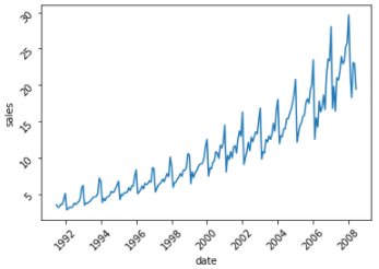
#Vislualize time series : ax <span class="has-inline-color has-vivid-green-cyan-color">= sns.lineplot(x<span class="has-inline-color has-vivid-green-cyan-color">="date", y<span class="has-inline-color has-vivid-green-cyan-color">="sales", data<span class="has-inline-color has-vivid-green-cyan-color">=df) ax.tick_params(rotation<span class="has-inline-color has-vivid-green-cyan-color">=<span class="has-inline-color has-vivid-red-color">45) plt.show()</span class="has-inline-color has-vivid-red-color"></span class="has-inline-color has-vivid-green-cyan-color"></span class="has-inline-color has-vivid-green-cyan-color"></span class="has-inline-color has-vivid-green-cyan-color"></span class="has-inline-color has-vivid-green-cyan-color"></span class="has-inline-color has-vivid-green-cyan-color"></span class="has-inline-color has-light-green-cyan-color"></span class="has-inline-color has-vivid-green-cyan-color"></span class="has-inline-color has-vivid-green-cyan-color"></span class="has-inline-color has-vivid-cyan-blue-color"></span class="has-inline-color has-vivid-cyan-blue-color"></span class="has-inline-color has-vivid-green-cyan-color"></span class="has-inline-color has-light-green-cyan-color"></span class="has-inline-color has-vivid-green-cyan-color"></span class="has-inline-color has-vivid-cyan-blue-color"></span class="has-inline-color has-vivid-green-cyan-color"></span class="has-inline-color has-vivid-green-cyan-color"></span class="has-inline-color has-vivid-cyan-blue-color"></span class="has-inline-color has-black-color"></span class="has-inline-color has-luminous-vivid-orange-color"></span class="has-inline-color has-black-color"></span class="has-inline-color has-luminous-vivid-orange-color"></span class="has-inline-color has-black-color"></span class="has-inline-color has-luminous-vivid-orange-color"></span class="has-inline-color has-black-color"></span class="has-inline-color has-luminous-vivid-orange-color"></span class="has-inline-color has-black-color"></span class="has-inline-color has-luminous-vivid-orange-color"></span class="has-inline-color has-black-color"></span class="has-inline-color has-luminous-vivid-orange-color"></span class="has-inline-color has-black-color"></span class="has-inline-color has-luminous-vivid-orange-color"></span class="has-inline-color has-black-color"></span class="has-inline-color has-luminous-vivid-orange-color">
As can be seen, there is a clear uptrend in sales.
We will first start our forecasting journey with a simple moving average
Simple Moving Average (SMA)
The SMA method of forecasting in time series is the unweighted average or mean of the previous N data points. You need to select a sliding window of the period through which the rolling average would be calculated and the time series would be smoothened out.
So, say for example if we have 10 months’ data and we plan to forecast using a 10-month sliding window; then the predicted value of the 11th month would be the simple average of month 1 to month 10; similarly, the prediction for month 12 would be mean of month 2 to month 11 data points.
SMA t = [xt + x t-1 +x t-2 + . . . x M-(t-1) ] / M [Where M = sliding window]
Cumulative Moving Average (CMA):
Like SMA, CMA is defined as the unweighted average of all past values. So, continuing with our previous example, if we need to predict for the 11th month we will take the average of 1 to 10 months; similarly, for the 12th month we need to take an average from 1 to 11 months; for the 13th month average of 1 to 12th month would be required and so on.
CMA t = (x1 + x2 +x3 + . . . . xt ) / t
We will now see examples of both SMA and CMA in python for our previous data set and will observe how SMA and CMA perform in terms of smoothing the time series and also for forecasting during some unseen period.
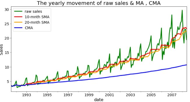
The code to first creates a 10 and 20 window SMA columns and a CMA column on the data set as below:
# SMA over a period of 10 and 20 months: df['<span class="has-inline-color has-vivid-cyan-blue-color">SMA_10'] <span class="has-inline-color has-vivid-green-cyan-color">= df.sales.rolling(<span class="has-inline-color has-vivid-red-color">10<span class="has-inline-color has-vivid-green-cyan-color">, min_periods<span class="has-inline-color has-vivid-green-cyan-color">=<span class="has-inline-color has-vivid-red-color">1).mean() df['<span class="has-inline-color has-vivid-cyan-blue-color">SMA_20'] <span class="has-inline-color has-vivid-green-cyan-color">= df.sales.rolling(<span class="has-inline-color has-vivid-red-color">20<span class="has-inline-color has-vivid-green-cyan-color">, min_periods<span class="has-inline-color has-vivid-green-cyan-color">=<span class="has-inline-color has-vivid-red-color">1).mean() # CMA : df['<span class="has-inline-color has-vivid-cyan-blue-color">CMA'] <span class="has-inline-color has-vivid-green-cyan-color">= df.sales.expanding().mean() df.head()</span class="has-inline-color has-vivid-green-cyan-color"></span class="has-inline-color has-vivid-cyan-blue-color"></span class="has-inline-color has-vivid-red-color"></span class="has-inline-color has-vivid-green-cyan-color"></span class="has-inline-color has-vivid-green-cyan-color"></span class="has-inline-color has-vivid-red-color"></span class="has-inline-color has-vivid-green-cyan-color"></span class="has-inline-color has-vivid-cyan-blue-color"></span class="has-inline-color has-vivid-red-color"></span class="has-inline-color has-vivid-green-cyan-color"></span class="has-inline-color has-vivid-green-cyan-color"></span class="has-inline-color has-vivid-red-color"></span class="has-inline-color has-vivid-green-cyan-color"></span class="has-inline-color has-vivid-cyan-blue-color">
Hereafter. We plot the time series with the raw values as well as the SMA and CMA forecasts.
# Grean = Raw sales , RED = 10 months SMA , ORANGE = 20 months SMA , BLUE = CMA colurs for the line plot colors = ['<span class="has-inline-color has-vivid-cyan-blue-color">green'<span class="has-inline-color has-vivid-green-cyan-color">, '<span class="has-inline-color has-vivid-cyan-blue-color">red'<span class="has-inline-color has-vivid-green-cyan-color">, '<span class="has-inline-color has-vivid-cyan-blue-color">orange'<span class="has-inline-color has-vivid-green-cyan-color">,"<span class="has-inline-color has-vivid-cyan-blue-color">blue"] # Line plot df.plot(color<span class="has-inline-color has-vivid-green-cyan-color">=colors<span class="has-inline-color has-vivid-green-cyan-color">, linewidth<span class="has-inline-color has-vivid-green-cyan-color">=<span class="has-inline-color has-vivid-red-color">3<span class="has-inline-color has-vivid-green-cyan-color">, figsize<span class="has-inline-color has-vivid-green-cyan-color">=(<span class="has-inline-color has-vivid-red-color">12,<span class="has-inline-color has-vivid-red-color">6)) plt.xticks(fontsize<span class="has-inline-color has-vivid-green-cyan-color">=<span class="has-inline-color has-vivid-red-color">14) plt.yticks(fontsize<span class="has-inline-color has-vivid-green-cyan-color">=<span class="has-inline-color has-vivid-red-color">14) plt.legend(labels <span class="has-inline-color has-vivid-green-cyan-color">=['<span class="has-inline-color has-vivid-cyan-blue-color">raw sales'<span class="has-inline-color has-vivid-green-cyan-color">, '<span class="has-inline-color has-vivid-cyan-blue-color">10-mnth SMA'<span class="has-inline-color has-vivid-green-cyan-color">, '<span class="has-inline-color has-vivid-cyan-blue-color">20-mnth SMA' <span class="has-inline-color has-vivid-green-cyan-color">,'<span class="has-inline-color has-vivid-cyan-blue-color">CMA'], fontsize<span class="has-inline-color has-vivid-green-cyan-color">=<span class="has-inline-color has-vivid-red-color">14) plt.title('<span class="has-inline-color has-vivid-cyan-blue-color">The yearly movement of raw sales <span class="has-inline-color has-black-color">&<span class="has-inline-color has-vivid-cyan-blue-color"> MA <span class="has-inline-color has-vivid-green-cyan-color">, <span class="has-inline-color has-vivid-cyan-blue-color">CMA'<span class="has-inline-color has-vivid-green-cyan-color">, fontsize<span class="has-inline-color has-vivid-green-cyan-color">=<span class="has-inline-color has-vivid-red-color">20) plt.xlabel('<span class="has-inline-color has-vivid-cyan-blue-color">date'<span class="has-inline-color has-vivid-green-cyan-color">, fontsize<span class="has-inline-color has-vivid-green-cyan-color">=<span class="has-inline-color has-vivid-red-color">16) plt.ylabel('<span class="has-inline-color has-vivid-cyan-blue-color">Sales'<span class="has-inline-color has-vivid-green-cyan-color">, fontsize<span class="has-inline-color has-vivid-green-cyan-color">=<span class="has-inline-color has-vivid-red-color">16)</span class="has-inline-color has-vivid-red-color"></span class="has-inline-color has-vivid-green-cyan-color"></span class="has-inline-color has-vivid-green-cyan-color"></span class="has-inline-color has-vivid-cyan-blue-color"></span class="has-inline-color has-vivid-red-color"></span class="has-inline-color has-vivid-green-cyan-color"></span class="has-inline-color has-vivid-green-cyan-color"></span class="has-inline-color has-vivid-cyan-blue-color"></span class="has-inline-color has-vivid-red-color"></span class="has-inline-color has-vivid-green-cyan-color"></span class="has-inline-color has-vivid-green-cyan-color"></span class="has-inline-color has-vivid-cyan-blue-color"></span class="has-inline-color has-vivid-green-cyan-color"></span class="has-inline-color has-vivid-cyan-blue-color"></span class="has-inline-color has-black-color"></span class="has-inline-color has-vivid-cyan-blue-color"></span class="has-inline-color has-vivid-red-color"></span class="has-inline-color has-vivid-green-cyan-color"></span class="has-inline-color has-vivid-cyan-blue-color"></span class="has-inline-color has-vivid-green-cyan-color"></span class="has-inline-color has-vivid-cyan-blue-color"></span class="has-inline-color has-vivid-green-cyan-color"></span class="has-inline-color has-vivid-cyan-blue-color"></span class="has-inline-color has-vivid-green-cyan-color"></span class="has-inline-color has-vivid-cyan-blue-color"></span class="has-inline-color has-vivid-green-cyan-color"></span class="has-inline-color has-vivid-red-color"></span class="has-inline-color has-vivid-green-cyan-color"></span class="has-inline-color has-vivid-red-color"></span class="has-inline-color has-vivid-green-cyan-color"></span class="has-inline-color has-vivid-red-color"></span class="has-inline-color has-vivid-red-color"></span class="has-inline-color has-vivid-green-cyan-color"></span class="has-inline-color has-vivid-green-cyan-color"></span class="has-inline-color has-vivid-red-color"></span class="has-inline-color has-vivid-green-cyan-color"></span class="has-inline-color has-vivid-green-cyan-color"></span class="has-inline-color has-vivid-green-cyan-color"></span class="has-inline-color has-vivid-cyan-blue-color"></span class="has-inline-color has-vivid-green-cyan-color"></span class="has-inline-color has-vivid-cyan-blue-color"></span class="has-inline-color has-vivid-green-cyan-color"></span class="has-inline-color has-vivid-cyan-blue-color"></span class="has-inline-color has-vivid-green-cyan-color"></span class="has-inline-color has-vivid-cyan-blue-color">
The generated time series chart looks like the below:
As can be seen, the cumulative moving average smoothes out the times series to a great extent but considering we haven’t worked on making the series stationary here first a 10 window SMA works better in terms of capturing the actual trend.
Check Out the Best Online Courses
Exponential Smoothing
Our next method of time series forecasting is called exponential smoothening or Exponential Moving Average (EMA).
Exponential smoothing is similar to SMA or CMA for forecasting purposes of time series but the only difference is that the model uses an exponentially decreasing weight for past observations. That means in the EMA method recent observations are given more weight as compared to the past ones.
The EMA function is defined as:
EMA t =a.x t + (1-a) * EMA t-1 (when t>0) [Where a is termed as smoothing factor]
Python implementation of the EMA is very easy. Just like the SMA and CMA, we can use a function called ewm, fix the necessary smoothing factors and the result would be generated.
# EMA : # Let's smoothing factor - 0.1 df['<span class="has-inline-color has-vivid-cyan-blue-color">EMA_0.1'] <span class="has-inline-color has-vivid-green-cyan-color">= df.sales.ewm(alpha<span class="has-inline-color has-vivid-green-cyan-color">=<span class="has-inline-color has-vivid-red-color">0.1<span class="has-inline-color has-vivid-green-cyan-color">, adjust<span class="has-inline-color has-vivid-green-cyan-color">=False).mean() # Let's smoothing factor - 0.3 df['<span class="has-inline-color has-vivid-cyan-blue-color">EMA_0.3'] <span class="has-inline-color has-vivid-green-cyan-color">= df.sales.ewm(alpha<span class="has-inline-color has-vivid-green-cyan-color">=<span class="has-inline-color has-vivid-red-color">0.3<span class="has-inline-color has-vivid-green-cyan-color">, adjust<span class="has-inline-color has-vivid-green-cyan-color">=False).mean()</span class="has-inline-color has-vivid-green-cyan-color"></span class="has-inline-color has-vivid-green-cyan-color"></span class="has-inline-color has-vivid-red-color"></span class="has-inline-color has-vivid-green-cyan-color"></span class="has-inline-color has-vivid-green-cyan-color"></span class="has-inline-color has-vivid-cyan-blue-color"></span class="has-inline-color has-vivid-green-cyan-color"></span class="has-inline-color has-vivid-green-cyan-color"></span class="has-inline-color has-vivid-red-color"></span class="has-inline-color has-vivid-green-cyan-color"></span class="has-inline-color has-vivid-green-cyan-color"></span class="has-inline-color has-vivid-cyan-blue-color">
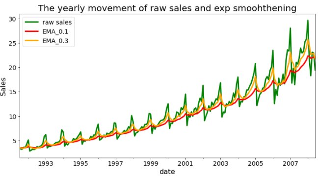
Let’s now visualize the time series with original raw sales figures as well as with the EMA forecast.
As can be seen, the EMA function works in sync with the actual series in most cases and is able to capture the trends and peaks.
Explore Free Online Courses with Certificates
Endnotes
In this article, we have discussed and introduced the concept of Time series analysis for forecasting. We have also briefly touched upon how a time series analysis model is built using basic methods like moving average and exponential smoothing. I hope this would be a good starting point for everyone to learn and apply the time series techniques. In the subsequent articles, we will discuss advanced techniques and testing aspects of time series.
Top Trending Tech Articles:
Career Opportunities after BTech | Online Python Compiler | What is Coding | Queue Data Structure | Top Programming Language | Trending DevOps Tools | Highest Paid IT Jobs | Most In Demand IT Skills | Networking Interview Questions | Features of Java | Basic Linux Commands | Amazon Interview Questions
Recently completed any professional course/certification from the market? Tell us what liked or disliked in the course for more curated content.
Click here to submit its review with Shiksha Online.


