
IELTS Graph Writing Task 1: Sample Questions and Answers
International English Language Testing System ( IELTS )


The IELTS writing task 1 consisting a graph is a visual presentation that appears in Task 1 as a "Report Writing" task. Students have to describe the features of the table/chart/map/graph that they see on their screen in the IELTS Writing task 1. Graphs can be presented as a "Line Graph" or a "Bar Graph". Candidates are asked to summarise the information by selecting and reporting the main features and making comparisons where relevant.
Q. What is the total allowed time for the Writing section of the IELTS exam?
A. The IELTS Writing section must be concluded within 60 minutes. This time frame includes time for both task 1 and task 2 of the IELTS Writing part.
Q. What are the two tasks of the IELTS Writing section and do we have to attempt both of these tasks?
A. Yes, it is mandatory to attempt both the writing tasks on the IELTS exam. You muct not take more than 60 minutes to complete these tasks. A brief description of both these tasks is given below.
In Task 1, you are required to articulate visual data using your own language, which may include a graph, table, chart, or diagram. Your response should consist of a minimum of 150 words and should be completed within approximately 20 minutes.
In Task 2, you will be presented with a perspective, argument, or issue that you are expected to analyze and discuss. This task necessitates a written response of at least 250 words, to be completed in around 40 minutes.
Understanding Graphs in IELTS Writing Task 1
You'll typically encounter these types of graphs in the IELTS Writing Task 1:
-
-
Purpose: Show changes in data over a continuous period.
-
Key Features: Lines that represent trends or patterns over time.
-
What to Focus On:
-
Overall trends (rising, falling, stable)
-
Key turning points (peaks, troughs)
-
Comparisons between different lines
-
Initial and final values
-
-
Example: Changes in temperature, sales figures over time.
-
-
-
Purpose: Compare different categories of data.
-
Key Features: Rectangular bars with lengths proportional to the values they represent.
-
What to Focus On:
-
Most and least significant categories
-
Comparisons between different categories
-
Significant differences in the values
-
-
Example: Sales of different products, number of people in different age groups.
-
-
-
Purpose: Show how a whole is divided into parts.
-
Key Features: Circles divided into segments that show proportions or percentages of the whole.
-
What to Focus On:
-
Largest and smallest segments
-
Comparisons between different proportions
-
Changes in the proportions (if there are multiple pie charts)
-
-
Example: Distribution of expenditure, market share of different brands.
-
-
Combined Charts:
-
Purpose: Present multiple types of information in one task.
-
Key Features: Often include a combination of the above (e.g., a line graph and a bar chart, or a pie chart and a table).
-
What to Focus On:
-
Separate analysis of each chart, in an organised and linked way
-
Comparisons between different types of data, if relevant
-
How different charts complement each other
-
-
Example: Travel data shown through a line graph and a bar chart.
-
Q. How to write your IELTS Writing task 1 answers?
A. The conducting body of the IELTS exam has described a few points that must be taken care of while attempting the IELTS Writing task 1 questions. These are:
- Write all responses using complete, grammatically correct sentences.
- Do not submit answers in bullet point or note format.
- Place your final responses only in the designated answer section.
- Personal notes may be made separately but those will not be counted toward evaluation.
- Any rough work or annotations outside the answer section will not be reviewed.
Q. What are the four assessment criteria for the IELTS Writing section?
A. Each certified IELTS examiner things of the following parameters when deciding how many marks to give to you based on your response in the IELTS Writing section:
- Task response/achievement,
- Coherence and Cohesion,
- Lexical Resources, and
- Grammatical Range and Accuracy.
Predict your IELTS, TOEFL, and PTE in just 4 steps!
Key Strategies for Analyzing Graph Charts
-
Identify the Type: Determine whether it is a line graph, bar chart, pie chart, or a combination.
-
Understand the Labels: Pay close attention to the axes (x and y) in line and bar charts and the segments in pie charts. Note the units of measurement and the categories represented.
-
Look for Key Trends/Features:
-
Trends: Focus on overall direction (increasing, decreasing, fluctuating, stable), patterns, and changes over time.
-
Comparisons: Highlight major differences between categories or data points.
-
Significant Data: Note any extremes or key data points (peaks, lows, high points, low points).
-
-
Make Note of Specific Data: Note down the figures that show important information.
Steps to Approach Graph in Writing Task 1
Step 1: Understanding the Task
The first step is to analyse the type of task given.
- Identify the graph presented, whether it is a graph of time or no time.
- Pay attention to the data on both axes. (time, categories, percentages)
Step 2: Planning the Response
After analysing, it is essential to plan your response. Planning includes deciding on the content to be included in the structure.
- In the Graph of Time, content includes base, trend, highest and lowest points.
- However, in the Graph of No Time, add content using variations. (50% - half, 10% - one-tenth, 2% - negligible etcetera)
A well-structured response will usually follow this pattern:
-
Introduction (1 sentence):
-
State the type of chart and the topic.
-
Use appropriate vocabulary: "The graph depicts..." "The chart illustrates..."
-
-
Overview/General Statement (1 sentence):
-
Summarize the key trends or overall patterns.
-
Do not get into specifics here. Give a general statement highlighting most significant data.
-
-
Body Paragraphs (2-3 Paragraphs):
-
Focus on key information from the chart.
-
Organize information logically.
-
Refer to the timeframes in the chart in order, using transition words.
-
Support your description with specific data, where relevant.
-
Use appropriate language:
-
Trends: increase, decrease, rise, fall, peak, fluctuate, plateau, remain stable
-
Comparisons: higher, lower, greater, less, similar, different, in contrast, while
-
Quantity: large, small, significant, slight, considerable, substantial
-
Time: from, between, in, during, by, over, until
-
-
-
Conclusion (1 sentence):
-
Summarize the main points discussed, but no new information.
-
Step 3: Writing about the Task
The content of the report needs to be divided into a three-paragraph structure.
- The introduction paragraph provides the paraphrasing and the overview of the task.
- Overview includes the highest or the dominating category, excluding the numbers/time.
- The Body paragraphs include the content of the graph given, highlighting the comparison where relevant.
Note - The structure remains the same, irrespective of the format of the graph (line or bar).
You can now refer to the model answer for the IELTS Writing Task 1 Graph, with a band score of 7 with an 8.5, along with the expert’s comments.
IELTS Writing Task 1 - Line Graph Example
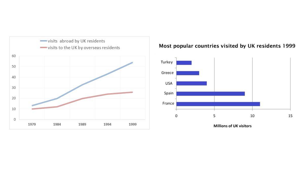
The charts below give information about travel to and from the UK, and about the most popular countries for UK residents to visit.
Summarise the information by selecting and reporting the main features, and make comparisons where relevant.
Write at least 150 words.
Understanding the Task
-
Task Type: Combined Charts (Line Graph and Bar Chart)
-
Objective: Describe and compare the trends in travel to and from the UK and the most popular countries visited by UK residents in 1999.
-
Key Actions:
-
Summarize the main features of the line graph and the bar chart.
-
Identify key trends and any changes over time in the line graph.
-
Note the most and least popular countries in the bar chart.
-
Make comparisons where relevant.
-
Write a clear and concise report with appropriate vocabulary, aiming for at least 150 words.
-
Key Elements to Focus On
-
Line Graph:
-
Trend for UK residents traveling abroad.
-
Trend for overseas residents visiting the UK.
-
Key years for changes in each line.
-
Comparison of the two lines over time.
-
-
Bar Chart:
-
Identify the most popular countries (highest bars).
-
Identify the least popular countries (lowest bars).
-
Highlight any significant differences in visitor numbers.
-
Link the data from the line graph to the bar chart where possible (e.g. UK residents travelling abroad were likely to be going to the countries listed in the bar chart).
-
Model Answer (Band 9 Level)
The charts illustrate data regarding travel to and from the UK, and the most popular countries visited by UK residents. The line graph depicts the trends in visits abroad by UK residents and visits to the UK by overseas residents between 1979 and 1999, whereas the bar chart shows the number of UK visitors to various countries in 1999.
The line graph reveals a significant upward trend in both visits abroad by UK residents and visits to the UK by overseas residents, especially from 1984 onward. Initially, in 1979, there were roughly 10 million visits abroad by UK residents and just under 10 million visits to the UK by overseas residents. By 1999, these figures had risen to approximately 55 million and just over 25 million, respectively. There was a dramatic increase of visits abroad by UK residents from 1984.
The bar chart, which presents data for 1999, shows that France was the most popular destination for UK residents, attracting nearly 15 million visitors. Spain was second, with about 9 million, followed by the USA and Greece, each with fewer than 5 million visitors. Turkey was the least popular, attracting approximately 1 million UK visitors in 1999.
In summary, the data shows a considerable rise in both outbound and inbound travel to the UK from 1979 to 1999. By 1999, UK residents favored European destinations such as France and Spain compared to other destinations like USA, Greece, and Turkey.
(Word Count: 198)
Explanation and Breakdown:
-
Introduction (1 sentence):
-
Clearly states the purpose of the charts.
-
Uses the phrase, "...illustrate data regarding travel to and from the UK..."
-
Briefly mentions what each chart shows.
-
-
Overview (1 sentence):
-
Gives an overview of both charts.
-
Uses words like "depicts" and "shows" to describe the charts and highlight what information they provide.
-
-
Body Paragraph 1 (2 sentences):
-
Describes the trends from the line graph.
-
Mentions the starting point, the major increase period, and the numbers in 1999.
-
Uses vocabulary related to trends such as "upward trend," "risen," and "dramatic increase."
-
-
Body Paragraph 2 (2 sentences):
-
Describes the data from the bar chart and makes comparisons among the countries.
-
Starts with a clear reference to the time frame ("data for 1999").
-
Uses words such as, "attracting" and "favored" to highlight the popularity of certain destinations.
-
-
Conclusion (1 sentence):
-
Summarizes the main points: increase in travel and popular destinations for UK residents.
-
The linking word "By" shows the link between both charts.
-
Uses the word "considerable" to summarize the trend over the period.
-
Why This Answer Scores Highly
-
Task Achievement: All parts of the task are addressed fully. The line graph and bar chart are accurately described.
-
Coherence and Cohesion: The response is well-organized with clear links between sentences and paragraphs using cohesive devices.
-
Lexical Resource: The vocabulary is broad and precise, using words related to data analysis, trends, and comparisons.
-
Grammatical Range and Accuracy: The response uses a range of grammatical structures used accurately and effectively.
Tips for IELTS Writing Task 1 Combined Chart Questions:
-
Understand the data: Analyze the key trends and differences in each chart.
-
Plan your structure: Start with a clear introduction and overview, then describe each chart in separate paragraphs.
-
Use appropriate vocabulary: Use vocabulary for trends, comparisons, and numbers.
-
Make connections: Try to link information from different charts where possible.
-
Be concise: Focus on the main features and avoid unnecessary details.
-
Check grammar and vocabulary: Proofread your work for any errors.
Key Vocabulary for Combined Charts
-
Trends: increase, decrease, rise, fall, fluctuate, peak, upward, downward, stable
-
Comparisons: higher, lower, greater, less, more, fewer, similar, different, most, least
-
Data: figure, number, amount, proportion, percentage
-
Bar Chart Verbs: attract, reach, account for, record, show
-
Line Chart Verbs: increase, decrease, rise, fall, grow, decline, fluctuate
-
Time: between, from, until, by, during, in, over
IELTS Writing Task 1 - Line Graph - Sample Response 1 - 7 Band Score
The given line graph represents the number of travellers who have visited the UK from overseas and also the number of UK residents who travelled abroad between the years 1979 to 1999. The bar graph illustrates the most popular countries to be visited by the residents of the UK in 1999. Overall, it can be observed that the highest amount of UK residents preferred to travel to France.
In the year 1979, over 12 million UK residents travelled abroad which was closely followed by overseas residents with one-tenth of them travelling to the UK in 1979, 11 million. Between the years 1984 and 1989, there was a sharp rise in the number of UK residents who travelled abroad, 20 million, whereas only a minute rise was seen amongst the overseas travellers coming to the UK, 12 million. By the year 1999 the number of UK resident travellers crossed five-tenth, 52 million, on the other hand, the number of overseas residents who travelled to the UK in 1999 reached nearly three-tenth, 28 million.
The most popular country to be visited by the residents of the UK was undoubtedly France with over 11 million travellers visiting the nation. Coming to a close second was Spain with 9 million UK visitors. Surprisingly, the US and France had seen a much lower number of visitors as compared to the former mentioned countries, 4 million and 3 million, while Turkey was the least popular nation amongst the lot to be visited by UK residents with just 2 million visitors.
This is an answer written by a candidate who achieved a Band 7 score, here is the expert’s comment.
The candidate has started with the appropriate paraphrasing in the first paragraph, with a partial overview.
The task requirement is covered, and the content has been divided into paragraphs appropriately, making it both a coherent and cohesive response, although there is a repetition of vocabulary in the second and third paragraphs(travellers, travelled, residents). The vocabulary resource is sufficient to allow understanding, but no skilful use of uncommon word choice, with repetition of some words. The candidate has a good grasp of grammar but has made some errors (have in the first paragraph, usage of with and which in body paragraphs).
IELTS Writing Task 1 - Line Graph - Sample Response 2 - 8.5 Band Score
The first line graph presents data on visits made by UK residents to other countries and includes information about overseas residents travelling to the UK between 1979 and 1999. The second bar chart illustrates the most popular destinations for UK residents in 1999. Overall, it is evident that the number of visits made by UK residents significantly outnumbered those made by foreigners coming to the UK. France emerged as the most favoured destination, with UK residents making the highest number of visits compared to other countries.
In 1979, there was a slight difference of nearly 2 million between the number of travels made by UK residents and overseas visitors, with approximately 12 million and 10 million, respectively. The number of visits made by UK residents showed a significant increase, surpassing 20 million between 1984 and 1989, while the number of overseas visitors grew gradually. By 1999, the number of outbound visits from the UK had surged to 52 million.
Examining the figures in the second bar chart, it is clear that there is a slight difference in the number of visits made to France and Spain by UK residents, approximately 12 million and 9 million, respectively. Although the number of visits to the USA, Greece, and Turkey remained below 5 million, the USA had the highest number of visits at nearly 3 million, while Turkey had the fewest.
This is an answer written by a candidate who achieved a Band 8.5 score, here is the expert’s comment.
The task is fully addressed, with accurate interpretation and summarisation of the information from the charts. A clear and concise overview is provided by addressing all the key details that are included and logically connected. The response is also well-organized with a clear progression of ideas. Linking words and phrases are used appropriately and effectively to ensure cohesion. Paragraphs are used effectively to separate different points and data interpretations. A wide range of vocabulary is used accurately and effectively. Some less common lexical items are used appropriately, demonstrating good lexical resource. Word choice is precise and enhances the clarity and sophistication of the task. A variety of complex sentence structures are used correctly. Grammar and punctuation errors are minimal and do not impede communication. A good balance of simple and complex sentence forms demonstrates grammatical flexibility.
IELTS Writing - Graph Task Mock Test
Key Tips for Success while Answering Graphs in IELTS Writing Task 1
-
Plan: Before writing, analyze the key features and plan the structure of your answer.
-
Time Management: Spend around 20 minutes on this task.
-
Focus on Data: Base your description on the provided data and avoid giving opinions.
-
Use Formal Language: Maintain a formal tone throughout the report. Avoid personal pronouns ("I" or "we").
-
Use Accurate Vocabulary: Use precise vocabulary related to charts, trends, and data.
-
Use a Range of Grammar Structures: Use simple and complex sentence structures correctly.
-
Use Transition Words: Use transitions to link ideas, paragraphs, and sentences smoothly. (e.g., Firstly, secondly, then, next, after that, similarly, whereas, in contrast, finally).
-
Proofread: Always review your work to correct grammar, vocabulary, spelling, and syntax errors.
-
Practice: Solve various graph chart questions to become comfortable with the test format and develop writing skill.
-
Focus on the Overview: The overview is very important in this type of task. Make sure that you spend time to write a well-summarised overview of the graph.
Key Vocabulary for Graphs
-
Trends: increase, decrease, rise, fall, grow, decline, fluctuate, peak, reach a high point, hit a low point, plateau, remain stable, level off
-
Comparisons: higher, lower, greater, less, more, fewer, similar, different, in contrast, whereas
-
Quantity: amount, number, figure, proportion, percentage, quantity
-
Adverbs: significantly, considerably, slightly, marginally, dramatically, sharply, substantially, moderately
-
Time: from, between, in, during, by, over, until
Additional Tips for IELTS Writing Task 1 Graph: Vocabulary and Grammar use
The graph contains various trends and data that need to be mentioned while summarising the information; thus, it is essential to use appropriate vocabulary, grammatical range, and accuracy.
Vocabulary to be used:
- Describing the trend - increase, decrease, fall, dip, soar.
- Degree of change - dramatically, drastically, considerably, moderately.
- Comparing the data - more than, less than, equal to, half of.
- Differences/Similarities - whereas, while, likewise, similarly.
- Indicating time - throughout, during, over the period.
Grammatical range to be used:
- Simple Present Tense - while paraphrasing the question.
Example: The line graph shows the data. - Simple Past Tense - when referring to data from a specific past year.
Example: In 2010, the preference for the course surged significantly. - Present Perfect - changes over the period to the present.
Example: The tourist' rate has shifted moderately over the period.
FAQs
Comments
(1289)
2 months ago
T
9 months ago
R
9 months ago
R
a year ago
M
a year ago
R
a year ago
Hello Mustafijur. If you are looking for assistance with applying to universities abroad. Get in touch with our Shiksha Study Abroad Counsellors and book a counselling session absolutely free, Click Here
a year ago
R
a year ago