Frequency Distribution: Theory to Practice
Learn frequency distribution and its types, from ungrouped to cumulative, and discover how it transforms business insights. Enhance decision-making with strategic applications in market research and operations management.

Frequency distribution is foundational when learning statistics and data analysis and when using the 7 QC Tools. It is common to confuse this statistical tool’s application when it comes to graphing and accurately communicating the distribution. Even when Excel or other spreadsheets pretty much automate the graphing process, you may still have the limitation of misentering data.
If you are stuck or need to brush up on this concept, let’s understand it together.
To explain frequency distribution, we’ll clarify its related concepts and its applications.
What is Frequency Distribution?
A frequency distribution is usually represented as a graph (often a histogram) or table, displaying well-organised and meaningful quantitative data for interpretation and analysis.
To understand frequency and distribution, know that the frequency is the number of times a value occurs in a class interval or class width. The frequency can also be ordered without a class interval. The distribution is the pattern of the entire data set.
Another thing to note is that the class interval is the difference between the upper and lower class limits. And distribution displays how data is spread across different class intervals.
Frequency distribution helps understand trends from large data sets when collected from their raw form. The visual representation shows data organised into class intervals, which is easier to understand for non-statisticians.
Charts that Use Frequency Distribution
Other than histograms, here are three types of charts that make use of frequency distribution in business contexts:
- Pie charts: They can visually represent frequency distributions by dividing a circle into sections. Each section represent a category or interval. The size of each indicate the percentage of observations in that category.
- Bar charts: Bar charts are another popular way to represent frequency distributions. They display the frequency distribution by using rectangular bars of equal width. The height of each bar represents the frequency or count of observations in each category or interval.
- Scatter plots: Scatter plots can be used to display the relationship between two variables. They can also incorporate frequency distribution by varying the size or colour of data points based on the frequency of observations falling within each combination of values.
Types of Frequency Distribution
There are four main types of frequency distribution based on how data is organised or grouped. Below you will also see the different types of charts where frequency distribution is applicable.
Ungrouped Frequency Distribution
This type of frequency distribution displays the number of observations for each individual value of a variable.
The ungrouped frequency distribution refers to the number of observations of each individual variable value.
For example, consider a test score dataset with values ranging from 0 to 100. An ungrouped frequency distribution would show the frequency of each individual score, such as the number of students who scored 80, 85, or 90.
Take this dataset - 68, 72, 75, 82, 82, 88, 88, 90, 92, 95, 95, 95, 96, 98.
| Score |
Frequency |
| 68 |
1 |
| 72 |
1 |
| 75 |
1 |
| 82 |
2 |
| 88 |
1 |
| 90 |
1 |
| 92 |
1 |
| 95 |
3 |
| 96 |
1 |
| 98 |
1 |
| 100 |
1 |
Here is how it will look in a bar chart form.

How many students have scored 82 and 95 marks commonly can be seen easily.
But here is the limitation. This dataset is easier to handle now when there are 11 students. Imagine a dataset that crosses 100 or 1000. Finding the mean or median would be difficult using an ungrouped frequency distribution.
Grouped Frequency Distribution
In this type, data is grouped into intervals or classes. The frequency of values falling within each interval is recorded.
Here, the data is grouped into class intervals. There is a record of the frequency of values falling within each interval.
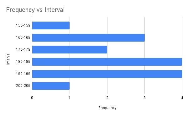
For instance, if you have a dataset of heights ranging from 150 cm to 200 cm, you can group the heights into intervals of 10 cm (150-160 cm, 160-170 cm, etc.) and record the frequency of observations falling within each interval.
Here is a grouped frequency table.
| Interval |
Frequency |
| 150-159 |
1 |
| 160-169 |
3 |
| 170-179 |
2 |
| 180-189 |
4 |
| 190-199 |
4 |
| 200-209 |
1 |
It is great for handling large data sets. Imagine viewing this data set as an ungrouped one. Or even calculating the median like that. This view offers an easy way to calculate.
Here is a better view in the form of a bar chart.
But there are some disadvantages to it, as well. The selection of data grouping can sometimes be too subjective. Also, individual data points within a group can lose meaning.
Cumulative Frequency Distribution
It visually depicts the running total of frequencies up to a specific value or interval. It offers information on the total number of observations below a certain class interval.
Let's use the example of a cumulative frequency distribution for a dataset of exam scores. Illustrating how many students scored below a certain mark or within a specific range of marks.
So, if the exam scores were 68, 72, 75, 82, 88, 90, 92, 95, 96, 98, and 102, the cumulative frequency distribution would be the following.
| Score Range |
Frequency |
Cumulative Frequency |
| 68-74 |
3 |
3 |
| 75-81 |
4 |
7 |
| 82-88 |
3 |
10 |
| 89-95 |
5 |
15 |
| 96-102 |
3 |
18 |
You can check the frequency and cumulative frequency calculation in our blog on Pareto Chart.
This table shows that the data provides a clear picture of how many observations fall below a certain threshold. This is particularly useful for understanding the distribution of scores or values within a dataset.
See the chart below.

Cumulative frequency distribution is dependent on the grouping of data into intervals. The choice of intervals can impact the insights gained from the cumulative distribution.
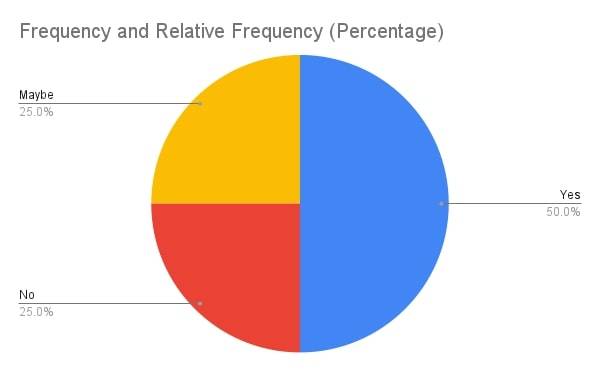
Relative Frequency Distribution
This type expresses the frequency of each value or interval as a proportion or percentage of the total frequency. It allows for the comparison of frequencies across different datasets.
For example, if you have a dataset of survey responses with three categories (Yes, No, Maybe), a relative frequency distribution would show the percentage or proportion of responses falling into each category.
An example of a dataset of this type could be responses in a survey.
Survey Responses: Yes, No, Maybe, Yes, Yes, No, Maybe, Yes, No, Maybe, Yes, Yes
Relative Frequency Distribution in a table would look like this.
| Response |
Frequency |
Relative Frequency (Percentage) |
| Yes |
6 |
50.00% |
| No |
3 |
25.00% |
| Maybe |
3 |
25.00% |
Here is a pie chart for this type of frequency distribution.
These frequency distributions help organise and summarise data, making understanding patterns, trends, and distributions within a dataset easier.
Applications of Frequency Distribution in Business
Frequency distribution can help in various business contexts. It is a good data visualisation technique that is great for the decision-making process.
In Market Research
Frequency distribution can help businesses segment their target market based on different variables such as age, gender, income, or geographic location. So this is done by
analysing the frequency of occurrence for each variable within the target market.
You may also read in-depth on customer segmentation to see how it’s done.
For example, a clothing retailer may use frequency distribution to analyse the purchasing behaviour of different age groups. By understanding the frequency distribution of purchases across age groups, the retailer can tailor their target marketing strategies and product offerings to better meet the preferences and needs of each segment.
In Operations Management
Frequency distribution and histograms especially are also valuable tools in operations management. By analysing the frequency distribution of key operational metrics such as production output, customer complaints, or inventory levels, businesses can identify patterns and trends that can inform strategic decision-making.
For example, a manufacturing company can use frequency distribution to analyse the distribution of production output to identify any potential bottlenecks or areas for improvement in their operations.
By visually representing the frequency distribution of production output, they can pinpoint any consistent patterns or irregularities and make informed operational decisions to optimise their processes.

Aquib is a seasoned wordsmith, having penned countless blogs for Indian and international brands. These days, he's all about digital marketing and core management subjects - not to mention his unwavering commitment ... Read Full Bio