- What is Pareto chart?
- Weightage of the Pareto Chart
- Illustrative Examples on Pareto Chart
- FAQs on Pareto chart
What is Pareto chart?
We have studied both bar and line graphs in statistics, but we also have a Pareto chart topic. A Pareto chart is also used to analyse or represent the data set, but it is formed when combining both line and bar graphs. Every bar in the chart represents an issue or a defect.
Here is an example of the Pareto chart to analyse customers’ feedback for a food court based on 4 things.
Applications of Pareto Chart
Pareto chart is mostly in the large scale industries and organisations to analyse the bulk of data. Some applications of the Pareto Chart are:
- It examines the global issues and helps in grabbing attention for rectifying the major issues first.
- For the yearly analysis of population growth of a country/ state/ district.
- To describe the set of bulk data that you have for other people.
- For surveying the organisation's revenue growth over a certain time period.
Certain operations for the grouped involved in the chapter are:
- Mean
- Mode
- Median
Weightage of the Pareto Chart
Pareto chart is a topic of Statistics. The chapter Statistics has its importance in class X and class XI; its applications greatly impact various competitive exams. The weightage of statistics in class X and class XI maths exams ranges from 5 to 6 marks.
Apart from the Pareto chart, there are also other graphical representations like a bar graph, line graph. The graphical representation helps in screening or analyzing the grouped data of an organisation, institute, etc. The operations of grouped data are also a part of the chapter.
Illustrative Examples on Pareto Chart
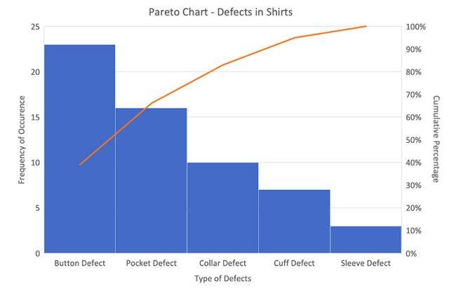
1. Suppose we want to analyse the data of defects on four types of defects complained by the customers, then draw a Pareto chart from the data received information.
| Types of Defect |
Frequency Defect |
Total Percentage |
Cumulative Percentage |
|---|---|---|---|
| Button Defect |
23 |
39.0 |
39.0 |
| Pocket Defect |
16 |
27.1 |
66.1 |
| Collar Defect |
10 |
16.9 |
83.1 |
| Cuff Defect |
7 |
11.9 |
11.9 |
| Sleeve Defect |
3 |
5.1 |
16.9 |
| Total |
59 |
|
|
Solution.
The sum of cumulative percentage will always be 100%, the Pareto chart for the above-mentioned data will be -
2. Mention some examples of the 80/20 rule for different sectors
Solution.
Let us consider we have 4 sectors by the name of business, health, crime, Food. Then the 80/20 rule for them can be:
For Business: 80% of the progress is done by 20% of the employees.
For Health: 80% of the bike accidents are caused due to 20% of drivers not wearing the helmet.
For Stock Market: 80% of the profit comes from 20% of the stock market.
For Food: 80% of the food is wasted by 20% of Asia's population.
FAQs on Pareto chart
Q: What is the main aim of the Pareto chart?
Q: What does the 80/20 rule explain in the Pareto chart?
Q: What is the other name of Pareto analysis?
Q: When was the Pareto principle invented?
Q: In what manner do the bars are arranged in a Pareto chart?
Maths Statistics Exam
Student Forum
Popular Courses After 12th
Exams accepted
CA FoundationExams accepted
ICSI ExamExams accepted
BHU UET | GLAET | GD Goenka TestBachelor of Business Administration & Bachelor of Law
Exams accepted
CLAT | LSAT India | AIBEExams accepted
IPMAT | NMIMS - NPAT | SET
Exams accepted
BHU UET | KUK Entrance Exam | JMI Entrance ExamBachelor of Design in Animation (BDes)
Exams accepted
UCEED | NIFT Entrance Exam | NID Entrance ExamBA LLB (Bachelor of Arts + Bachelor of Laws)
Exams accepted
CLAT | AILET | LSAT IndiaBachelor of Journalism & Mass Communication (BJMC)
Exams accepted
LUACMAT | SRMHCAT | GD Goenka Test


