- What is Bar Graph?
- Weightage of Bar Graph
- FAQs on Bar Graph
What is Bar Graph?
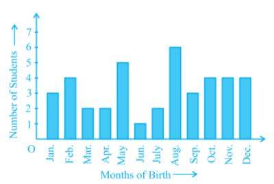
A bar graph is a graph that is used to represent the grouped data and compares the various categories. It gets represented as parallel bars in the form of vertical rectangles. The bars are drawn for all the categories, and the height/length of the bar helps to compare different categories.
Source: NCERT
Classification of bar graphs
The bar graphs can be classified into below two categories depending upon the axis on which bars are present:
Vertical bar graph: In a vertical bar graph, the data are represented in the form of vertical bars. The height of the bars represents the value for that category. In a vertical bar graph, the bars are present on the x-axis.
Horizontal bar graph: In a horizontal bar graph, the data is represented in the form of horizontal bars. The length of the bars represents the value for that category it represents. In a horizontal bar graph, the bars are present on the y-axis.
In addition to these two categories, there are two more types of bar graphs, as explained below:
Grouped bar graph: Grouped bar graph is also called the clustered bar graph. These are used to represent the data of different objects from the same category. The data of each object is represented by a separate bar in a different colour.
Stacked bar graph: Stacked bar graphs represent the data of different objects from the same category, but one category consists of a single bar with data of all the objects stacked over each other. The data of the objects have different colours or patterns to differentiate from each other.
How to plot data using a bar graph?
Follow the below steps to create a bar graph:
Step 1: Draw two lines perpendicular to each other and intersect at axis 0.
Step 2: Mark the horizontal line as the x-axis and the vertical line as the y-axis.
Step 3: Write the category names on the x-axis and mark the position of bars for each category.
Step 4: Select a scale to represent on the y-axis.
Step 5: Draw the bar graphs for each category having a length of bar equal to the value.
Weightage of Bar Graph
Bar graphs are mainly used to compare the data of different groups or categories or to compare how the value of a category changes over time. They provide a visual representation of the data for better understanding. It is an important topic for class x maths students as it has many applications to analyze the data. From the exam point of view also, this topic holds importance as there are 10 questions from the statistics unit. You can expect 3 or 4 questions related to bar graphs.
Illustrative Examples on Bar Graph
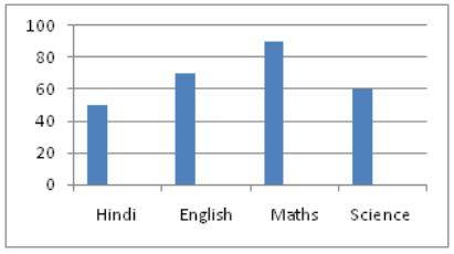
1: Draw a bar graph for the marks a student gets in the below subjects:
Hindi 50, English 70, Maths 90, Science 60
Solution.
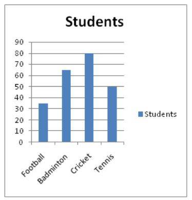
2.Draw a bar graph for the number of students playing the below sports:
Football 35, Badminton 65, Cricket 80, Tennis 50
Solution.
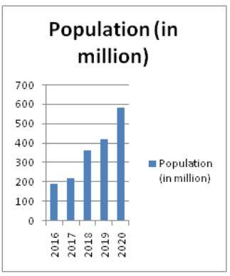
3. Draw a bar graph for the population (in million) of a country for the last five years:
2020-580, 2019-420, 2018-360, 2017-220, 2016-190
Solution.
FAQs on Bar Graph
Q: When can I use a bar graph?
Q: When can I use the horizontal bar graph?
Q: When can I use the vertical bar graph?
Q: Define the difference between Histograms and Bar Graphs?
Q: Define the Double Bar Chart.
Maths Statistics Exam
Student Forum
Other Class 11th Maths Chapters
Popular Courses After 12th
Exams accepted
CA FoundationExams accepted
ICSI ExamExams accepted
BHU UET | GLAET | GD Goenka TestBachelor of Business Administration & Bachelor of Law
Exams accepted
CLAT | LSAT India | AIBEExams accepted
IPMAT | NMIMS - NPAT | SET
Exams accepted
BHU UET | KUK Entrance Exam | JMI Entrance ExamBachelor of Design in Animation (BDes)
Exams accepted
UCEED | NIFT Entrance Exam | NID Entrance ExamBA LLB (Bachelor of Arts + Bachelor of Laws)
Exams accepted
CLAT | AILET | LSAT IndiaBachelor of Journalism & Mass Communication (BJMC)
Exams accepted
LUACMAT | SRMHCAT | GD Goenka Test


